Reimagining Onboarding for the Digital Travel Era
SITA AIR APP was created to help airlines, airports, and partners visualize how a digital passport ecosystem can streamline travel experiences.
My Role
Lead UX/UI Designer
Duration
2 Months
Tool
Figma, Miro
Platform
Mobile
Goal
Make the demo experience task-first, mobile-native, and SITA-consistent - so stakeholders understand value fast, navigate core flows with minimal narration, and use the demo to accelerate partner conversations and new business.
Constraints
1) No budget/scope for user interviews or usability testing
2) No established SITA mobile design system
3) Multi-audience context (sales, product, leadership, airline stakeholders)
4) SDK bundle size ≤ 80MB; avoid additions that increase app weight
5) Security-first build, developers can’t use external libraries or plugins (to meet security/compliance constraints).
What is SITA AIR?
SITA AIR is a mobile demo app that showcases how digital passports and mobile boarding can streamline the travel experience through a secure, intuitive, mobile-first journey.
Why we rebuilt it?
The earlier version wasn’t “demo-friendly”—it lacked a strong flow and confidence cues. We rebuilt it to make the story easier to present supporting quicker stakeholder decisions and helping SITA win new clients.
Before:
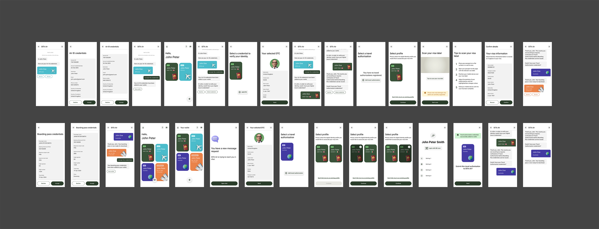
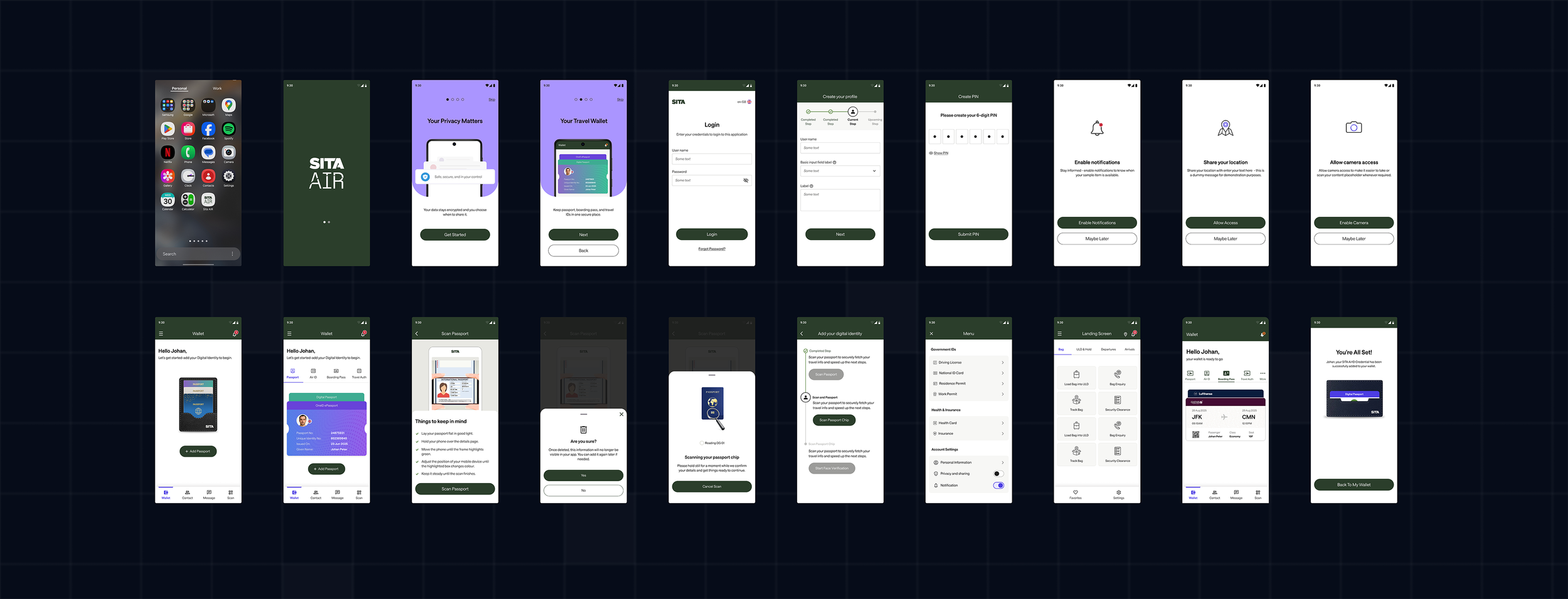
After:
What I changed
Reduced information overload
Simplified language using user mental models
Made trust visible in the UI
Made the flow shorter
Added accessibility
Aligned with SITA family UI
Made it build-ready
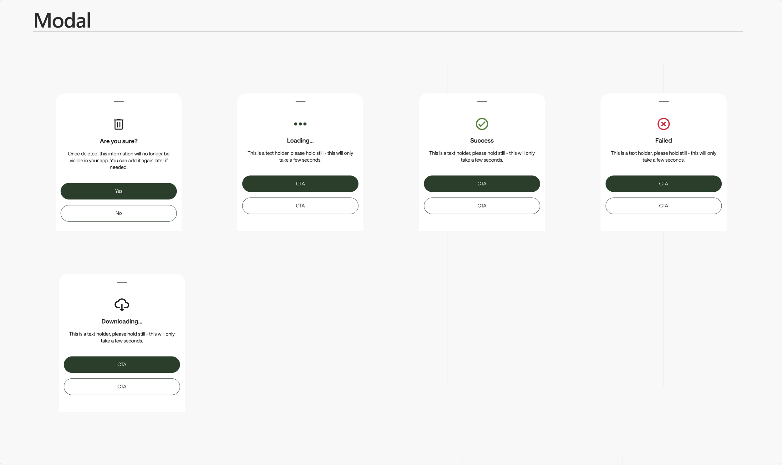
Results
Simplified setup flow
Improved accessibility
My Approach
Discovery & Alignment Workshop

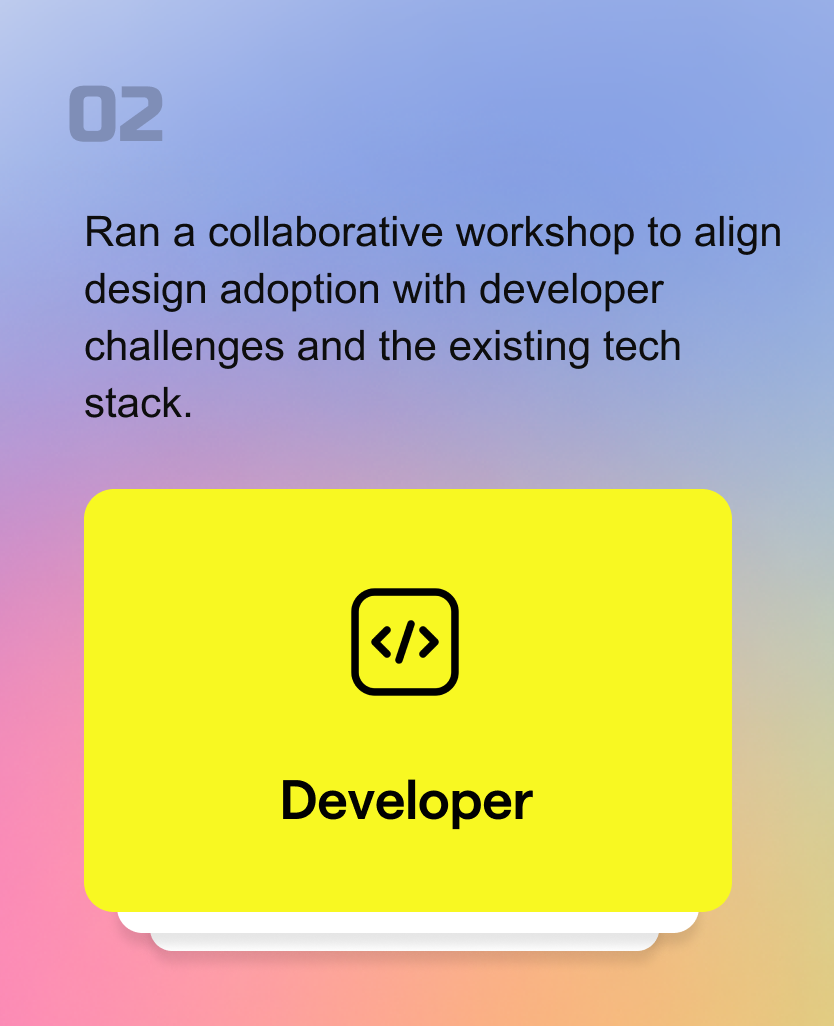
Developer Workshop Synthesis

Cross-platform parity: interactions must work on both iOS + Android
Stake Holder Workshop Synthesis
Primary buyer (Airlines)
We aligned that the demo must speak to airline KPIs first—INAD risk reduction, faster boarding flow, and compliance confidence while still showing value for airports and governments.
Benefit for Airlines
Airlines can automate document-checking processes.
With direct communication between passengers and authorities, airlines are released from operational burden of checking documents. The number of inadmissible passengers is reduced.
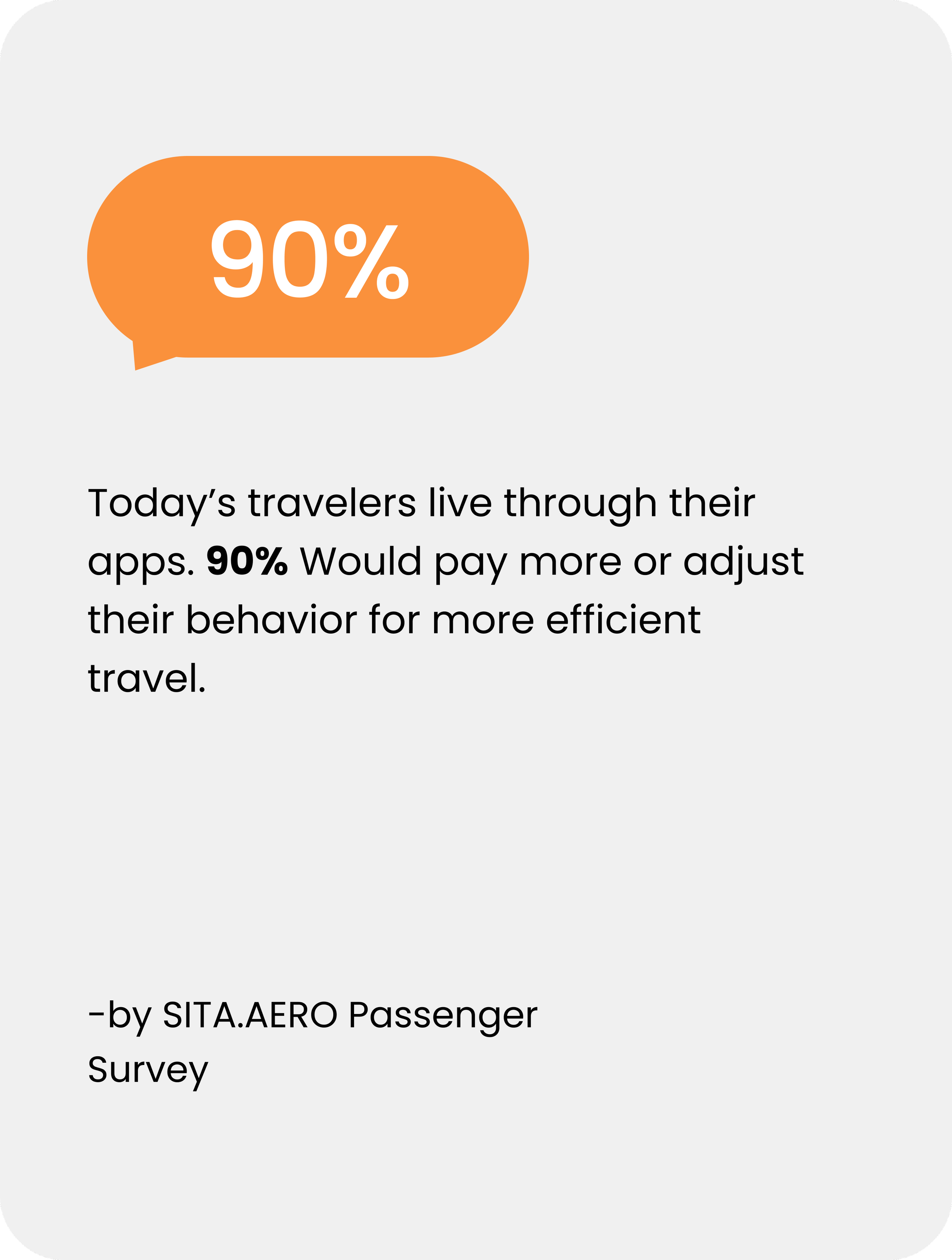
Passenger processing time is lowered.
The quality of passenger data submitted to airlines is increased.
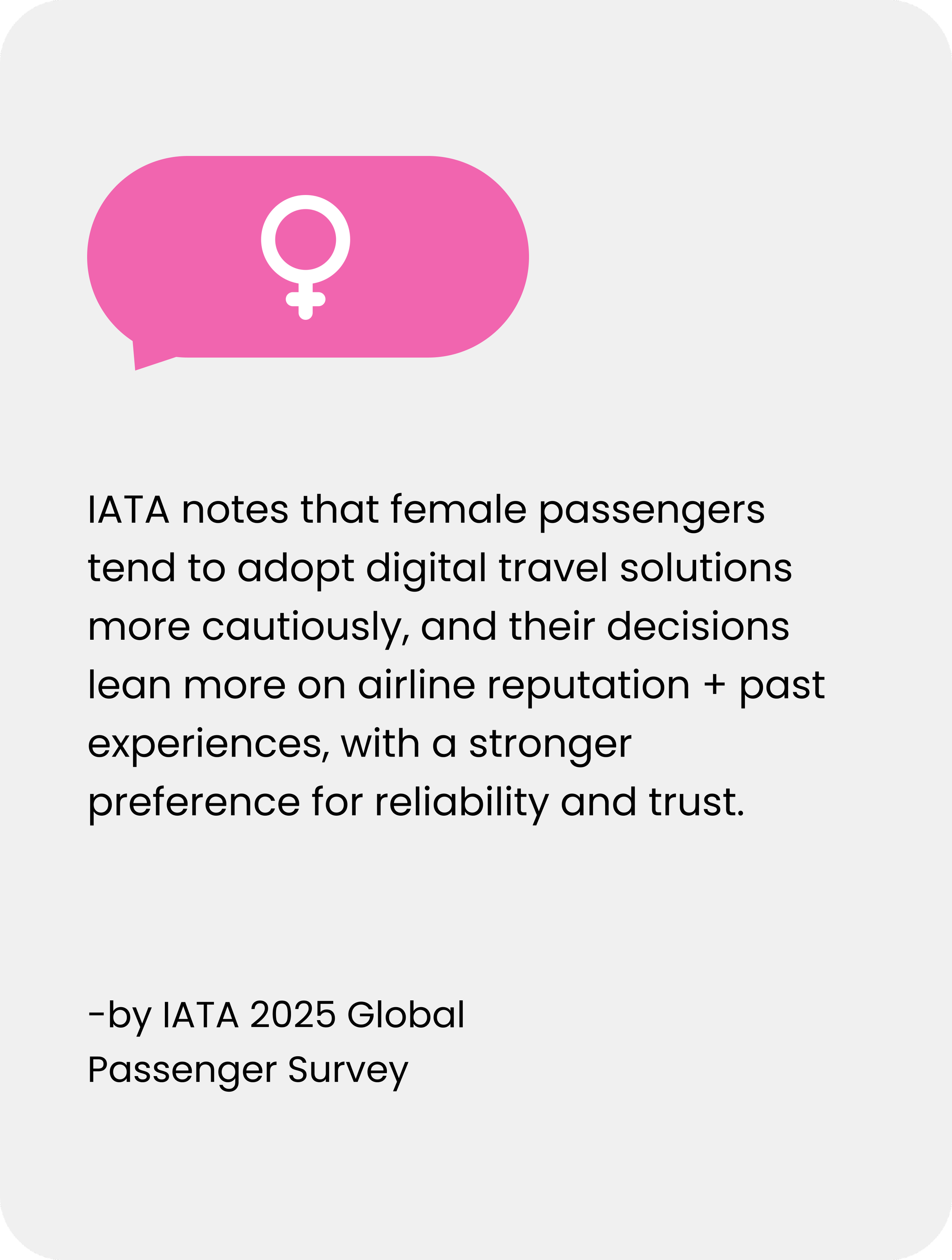
Primary user (Travelers)
Even though airlines buy it, travelers use it—so the experience must feel fast, secure, and in-control to drive adoption and smooth operations.
Benefit for Travelers
Travellers can digitally demonstrate to the airline that they meet all the travel requirements (e.g., visa) to the destination country before reaching the airport.
By simply presenting their face, they don’t need to repeatedly present travel documents.
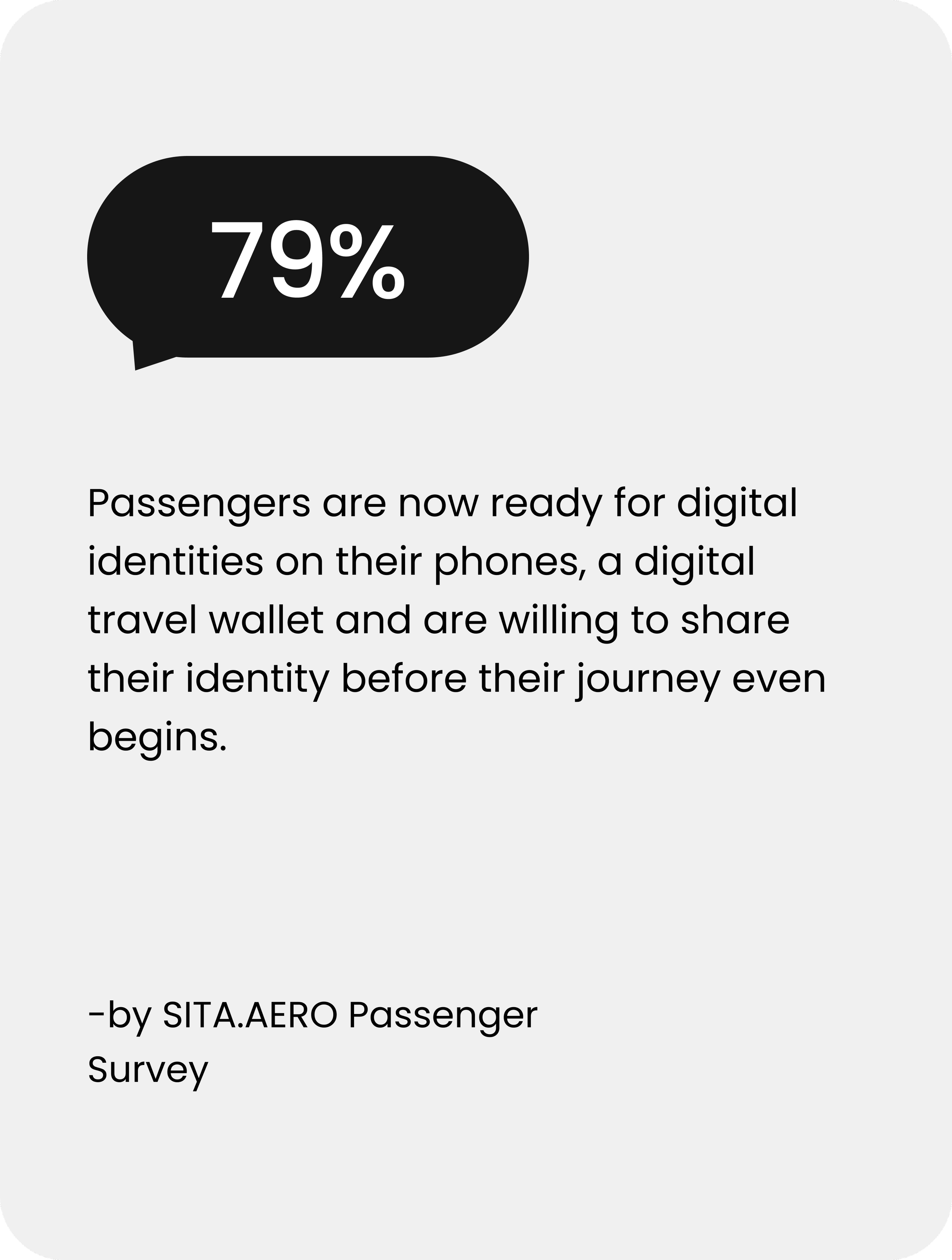
Passengers remain in control of their personal data and are provided with informed consent before sharing their credentials.
Benefit for Governments
Border authorities have direct control over which passengers are allowed to enter the country.
Advance data sharing offers governments a chance to conduct a risk analysis on travellers and combat cross-border criminal activities.
Document fraud is prevented, improving border security and passenger facilitation.
Security-first build: no external plugins/libraries due to security + permission risks
Size budget: ship within ≤ 80 MB to meet client expectations
Phase 01 — Pitch Demo (MVP)
Purpose
Prove SITA’s digital-identity value through one end-to-end traveler journey that airline buyers can confidently say “yes” to.
Workshop anchors
Primary buyer: Airlines (commercial + compliance lens)
Primary user: Travelers (adoption + trust lens)
What we needed to prove (success criteria)
Traveler: Speed + Trust + Control (fast steps, reassurance, transparent sharing)
Airline: Lower INAD exposure + Faster check-in/boarding + Stronger compliance confidence
Artifacts shipped (what came out of this phase)
Hero Journey: the one end-to-end flow that sells the value
Pitch-ready prototype (only the moments that matter)
Phase 02 — Native Design Guidelines
Purpose
Make delivery repeatable: turn demo learnings into native standards teams can ship with consistently.
Why now
Without native guidelines, every new screen becomes a debate—patterns drift, handoffs slow, and inconsistency creeps in.
What we needed to prove (success criteria)
Consistent native patterns across iOS/Android
Reusable components that reduce reinvention
Predictable interaction rules that reduce rework
Artifacts shipped (what came out of this phase)
Native component + pattern library
Interaction rules
Form templates (text fields, dropdowns, date pickers)
Error handling + empty states guidance
Constraint
PHASE 01- This phase had no budget for user testing
Approach
I reduced risk using UX inspection (heuristics + walkthroughs) and planned rapid validation
Audit the Existing Experience
I started with a heuristic audit to quickly assess the current flow, uncover usability gaps.
Current end-to-end setup flow
Key pain points identified in the heuristic audit
Cognitive Load
Technical terminology (Digital ID, Credential, DTC) creates confusion.
Repeated profile/credential selections increase decision fatigue.
Efficiency
Information and confirmations are fragmented across too many screens.
Clarity & Orientation
No clear step indicator; similar screens with repeated CTAs.
Subtle or unclear system feedback after key actions.
Secondary Research Used to Validate the Direction
Proto Persona
Created as a hypothesis persona to align design decisions when interviews weren’t possible in this phase (time/budget constraints), using heuristic audit + secondary research.
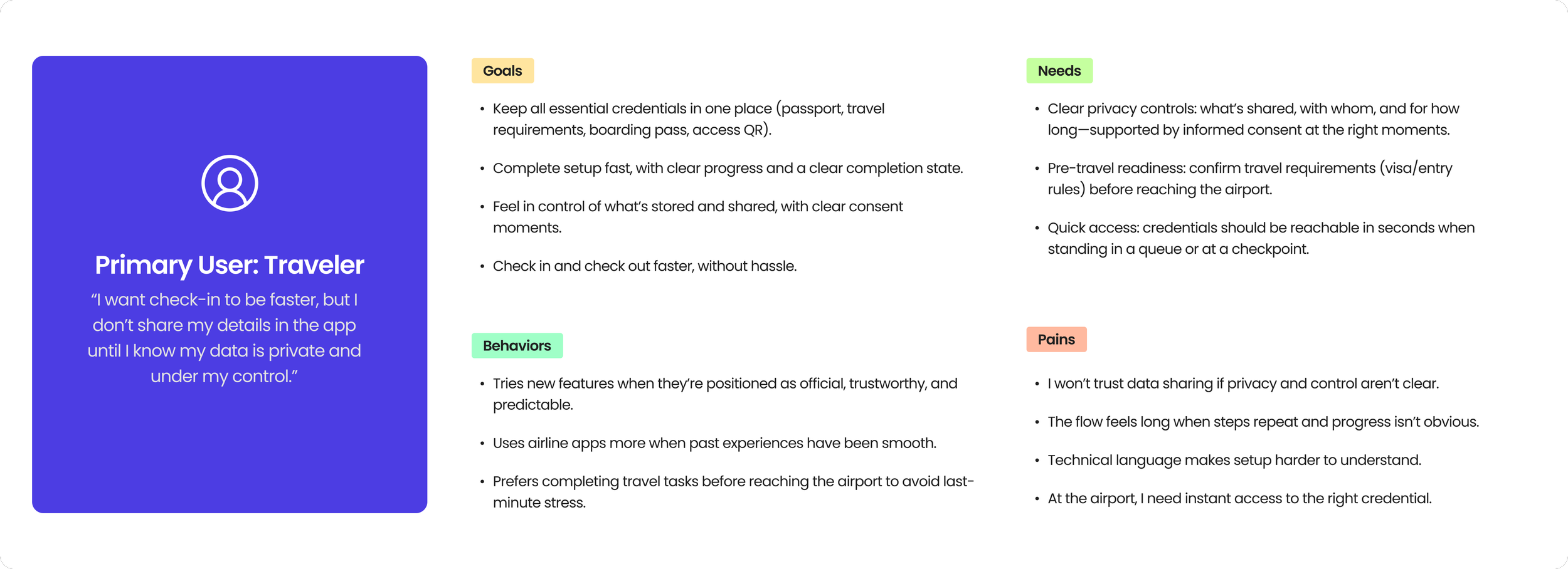
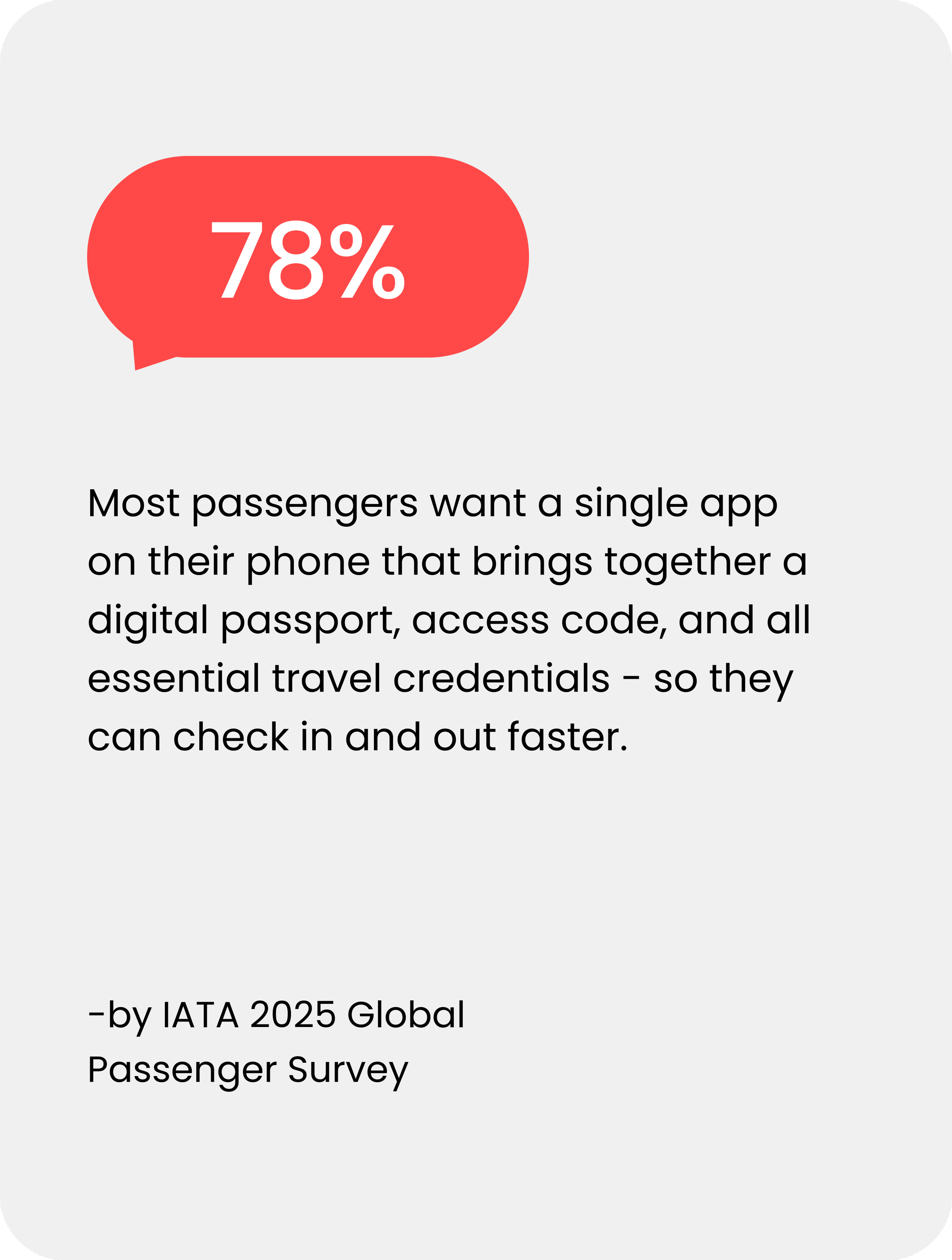
How might we help travelers add credentials in the app in a way that builds trust and helps them move faster through airport queues?
The flow helped prioritize where to simplify steps, reduce repeated decisions, and add clearer system feedback to improve completion.
Mapped decision branches, failure states, and system feedback moments across setup.
Visualize the full setup journey (happy path + branches)
Identify intervention points to reduce friction and drop-offs
Surface edge cases + unclear states (retries, permissions, failures)
Align team on flow logic + feedback requirements
System Thinking & User Flow Mapping
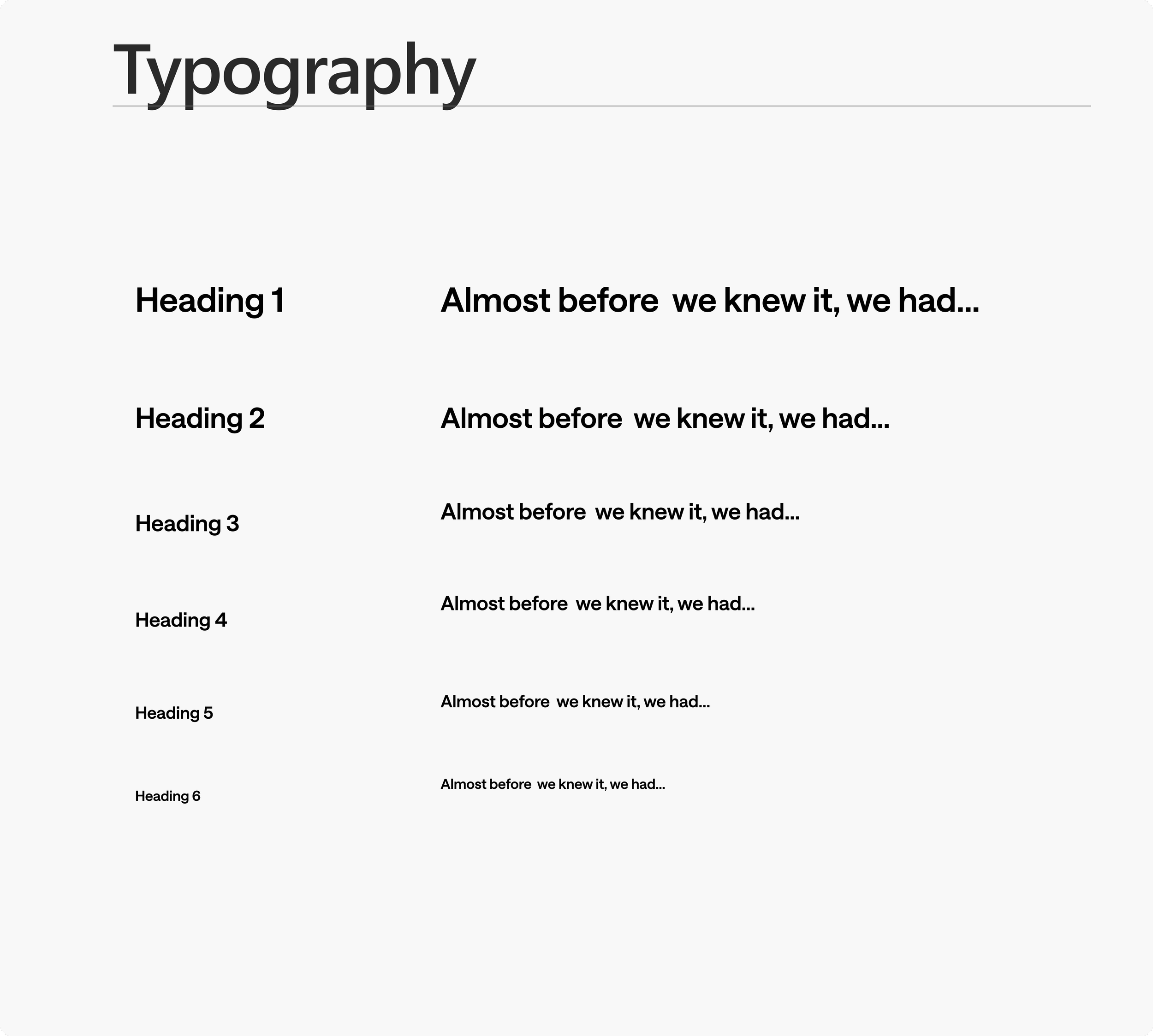
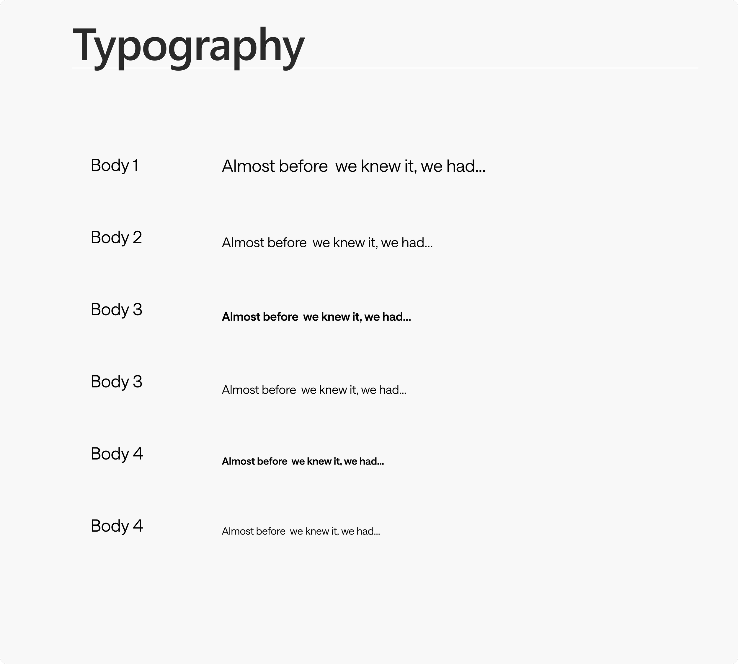
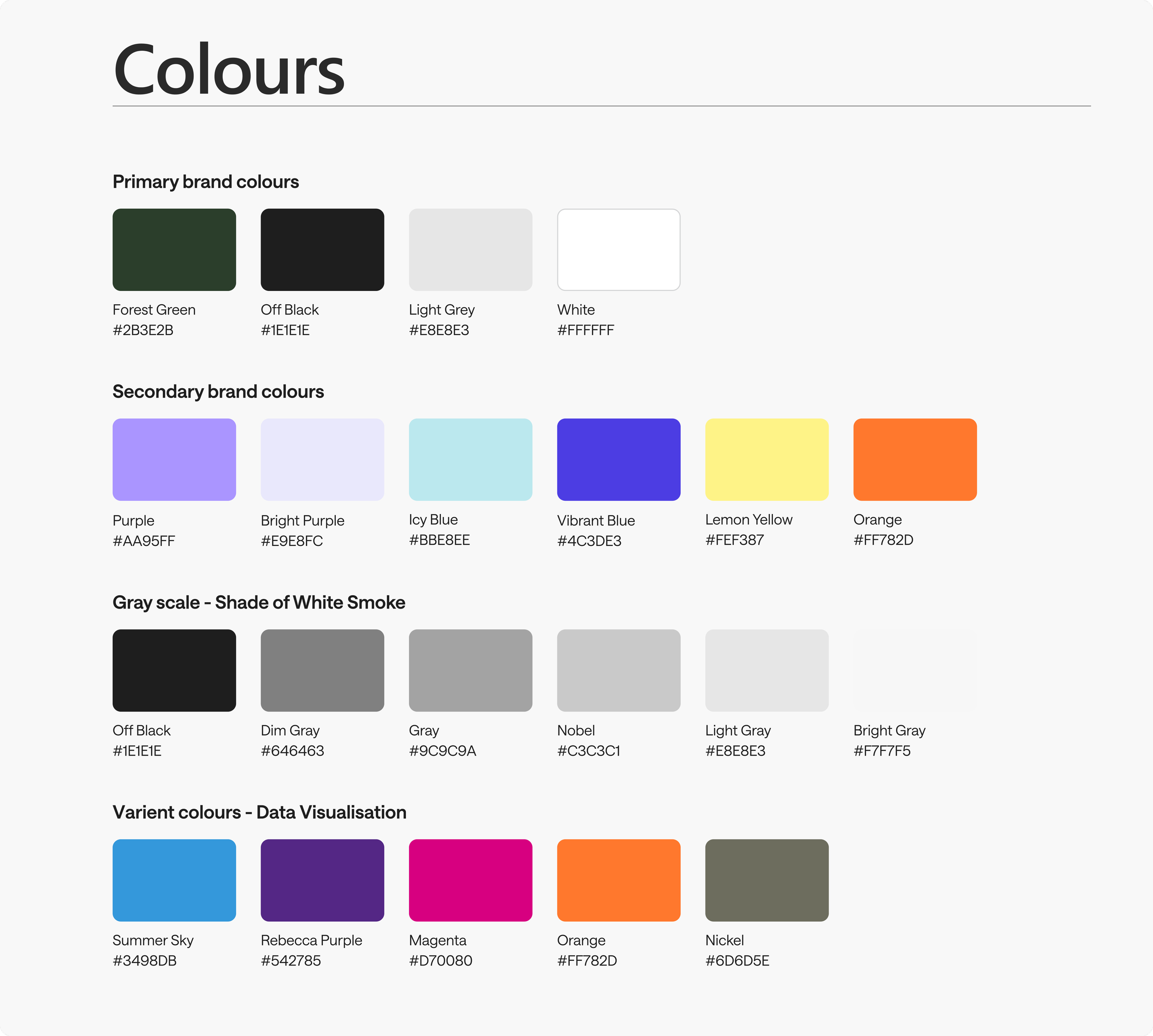
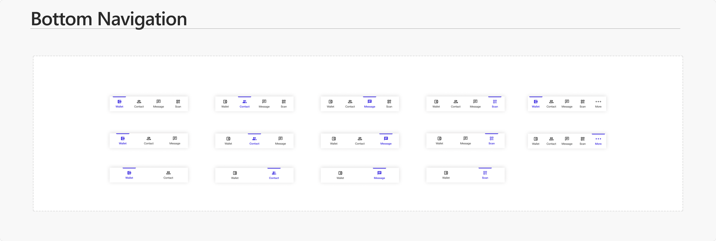
Created mobile-first style guide
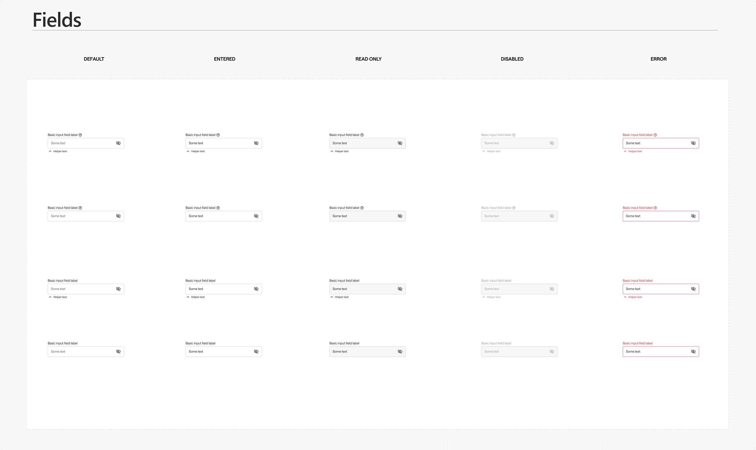
Final Design
Execution
Next, I translated the audit + flow into a polished, shippable interface.
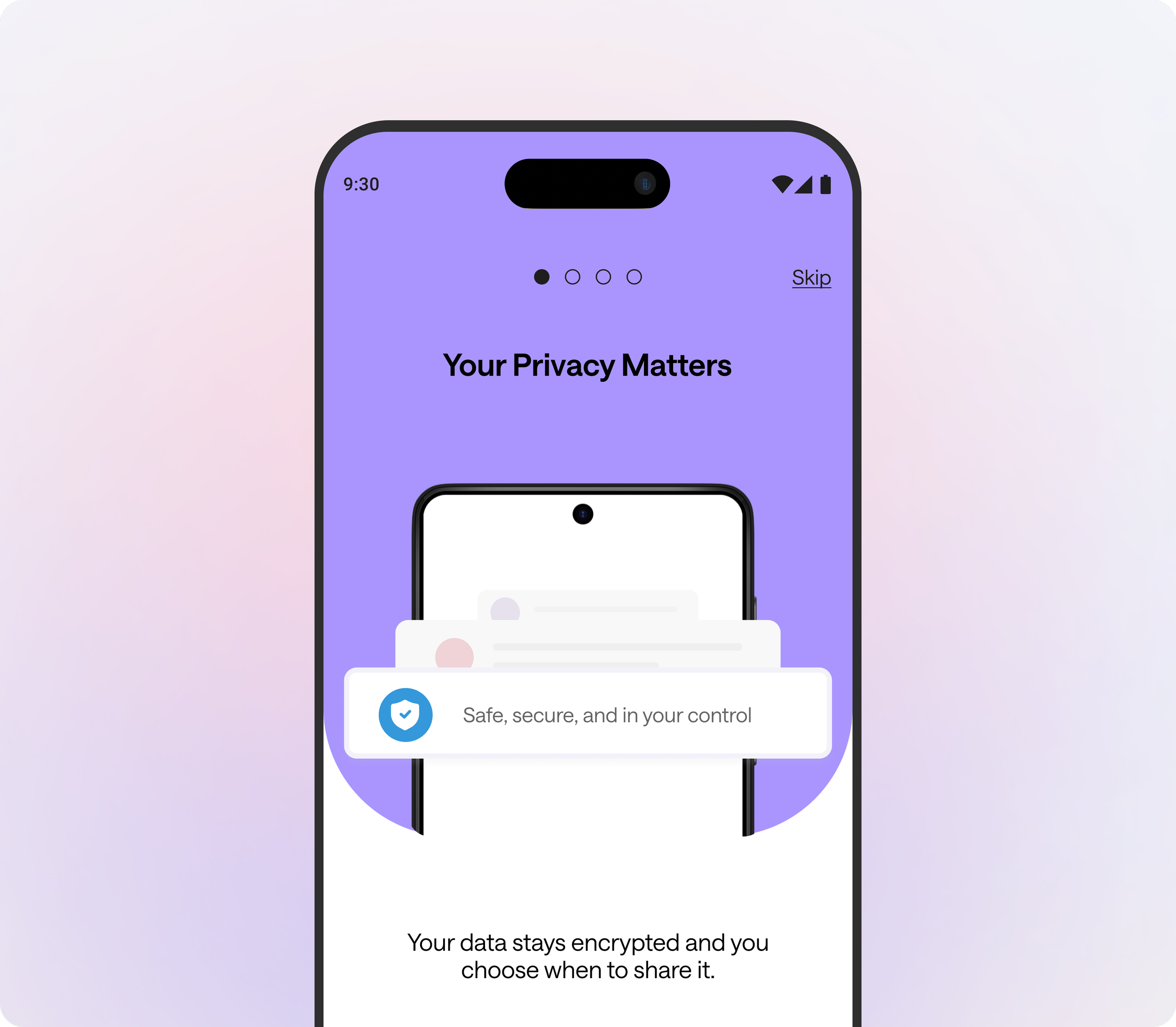
Onboarding that earns trust
I used onboarding to earn trust and clarify value before asking users to start identity setup
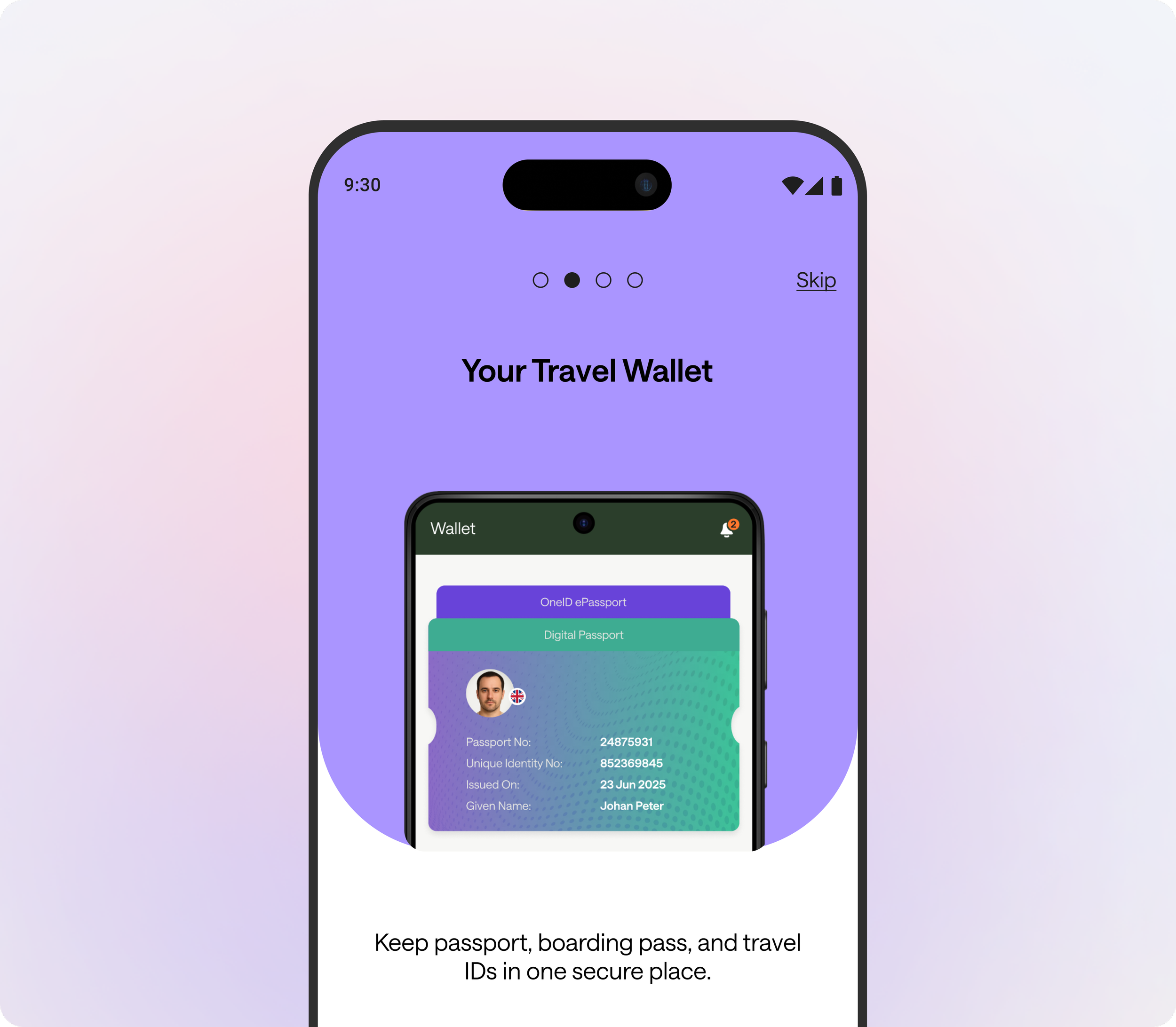
Start with the Wallet. Build Trust.
I used a wallet-first setup to make privacy + purpose clear upfront - so travelers start identity creation feeling in control and confident.
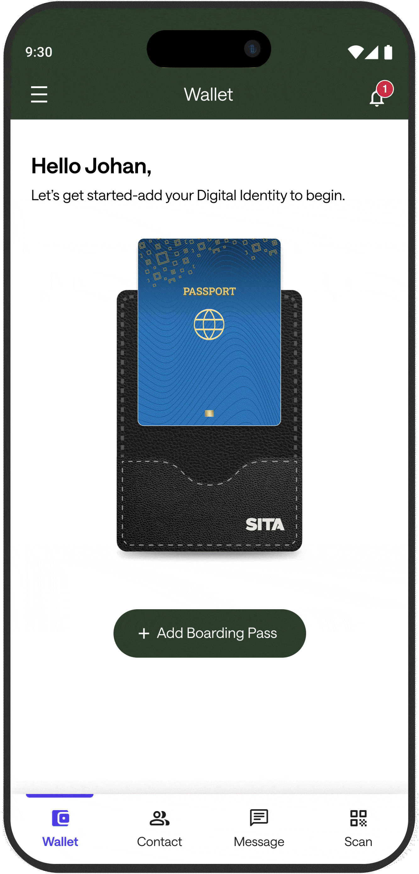

Refined experience
1) One primary CTA to start setup
2) Wallet mental model reinforces secure storage + user control
3) Clear, guided entry into the setup journey
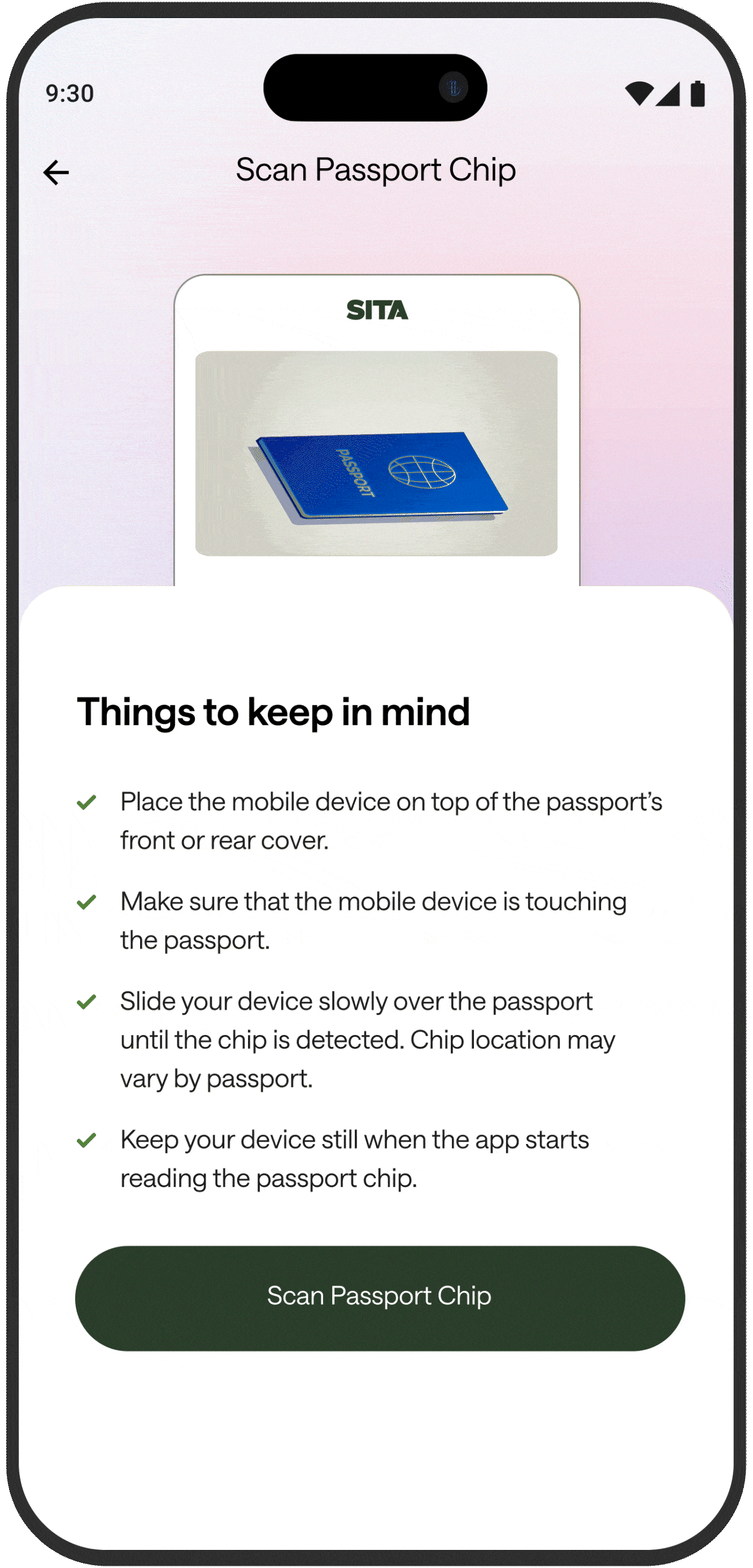
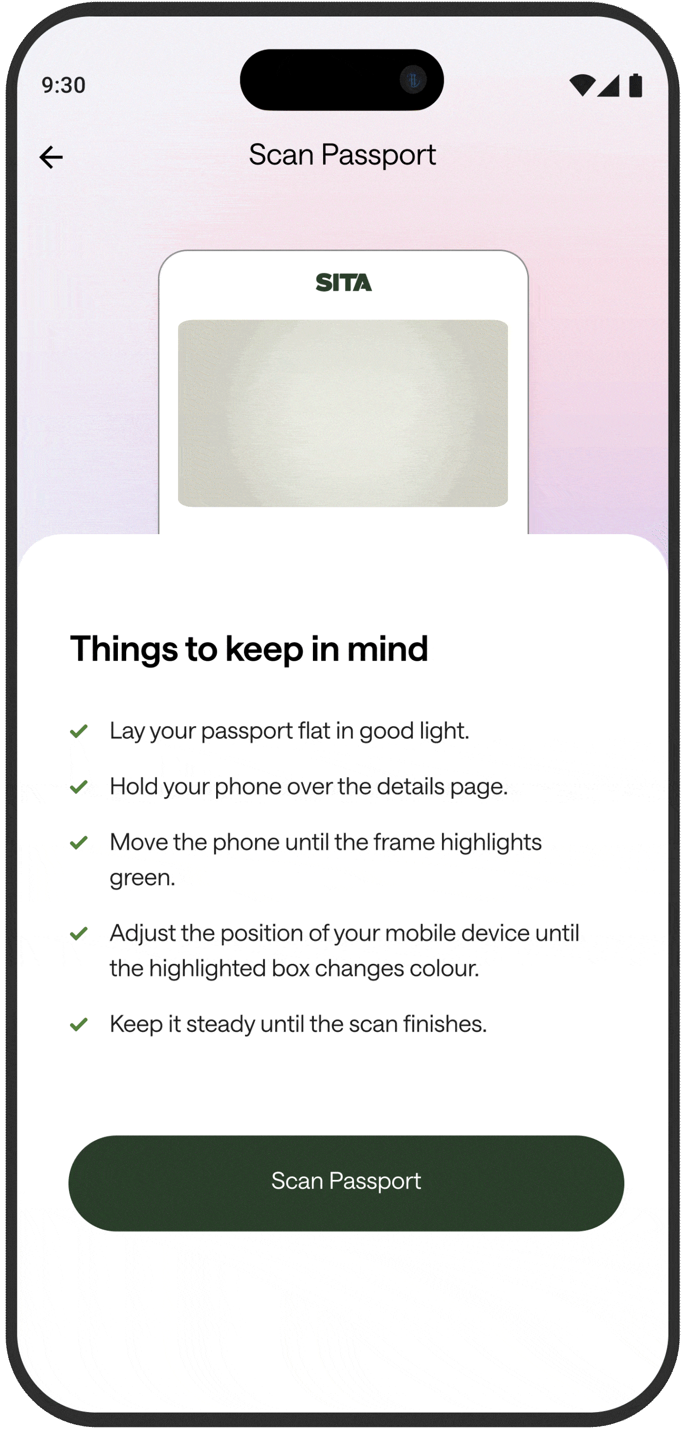
Guided scanning, made effortless
I created a short, step-by-step animated tutorial for scanning the passport page and chip—so travelers always know what to do next. Simple “things to keep in mind” tips plus one primary CTA keep the flow focused, reduce errors, and improve first-try scan success.
Design decisions → impact
Step-by-step pointers (before action) → users start scanning with the right setup, reducing scan failures and drop-offs.
Visual example + checklist together → removes ambiguity (“where do I place the phone?”) and speeds up comprehension.
One primary CTA per screen → keeps attention focused and drives clean task completion without hesitation.
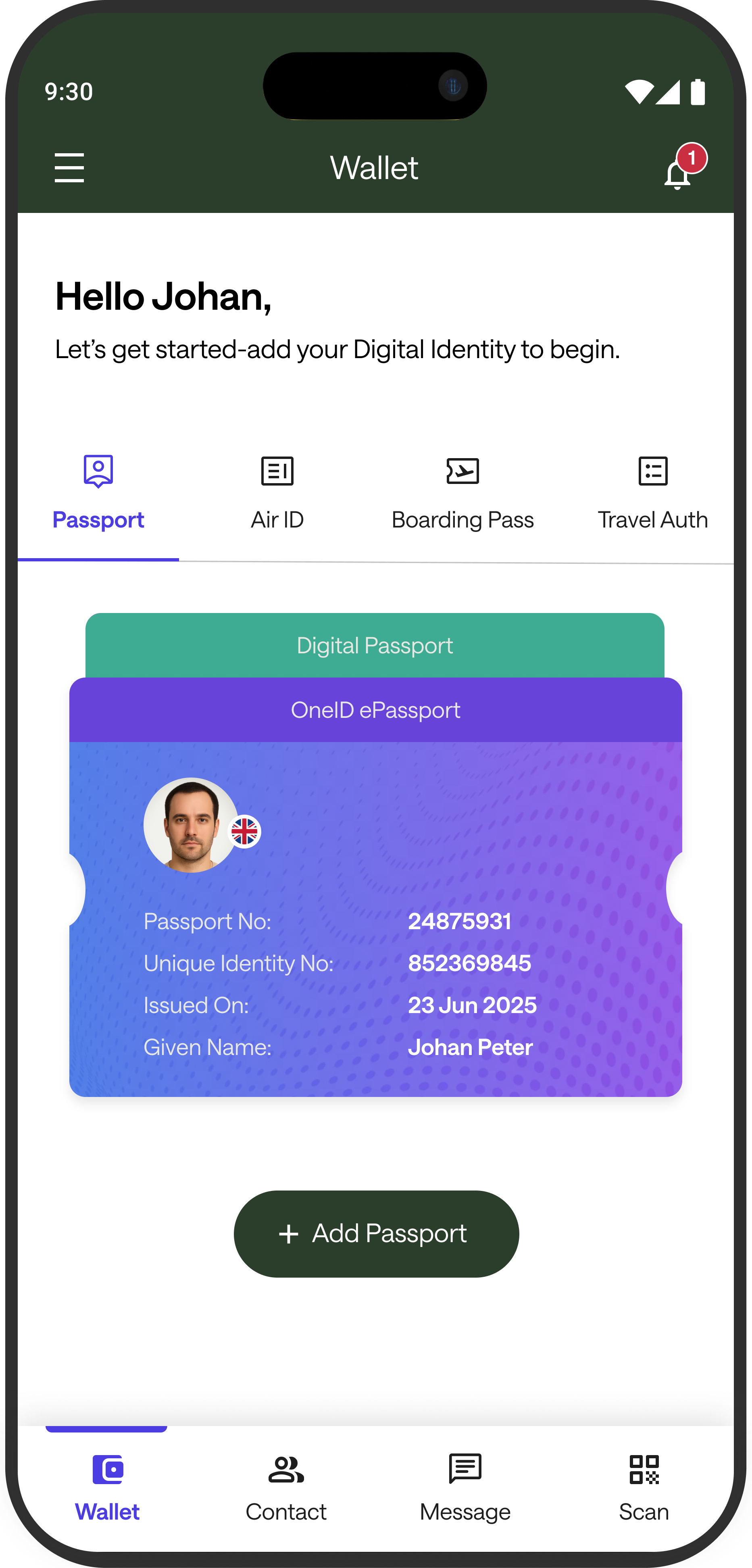
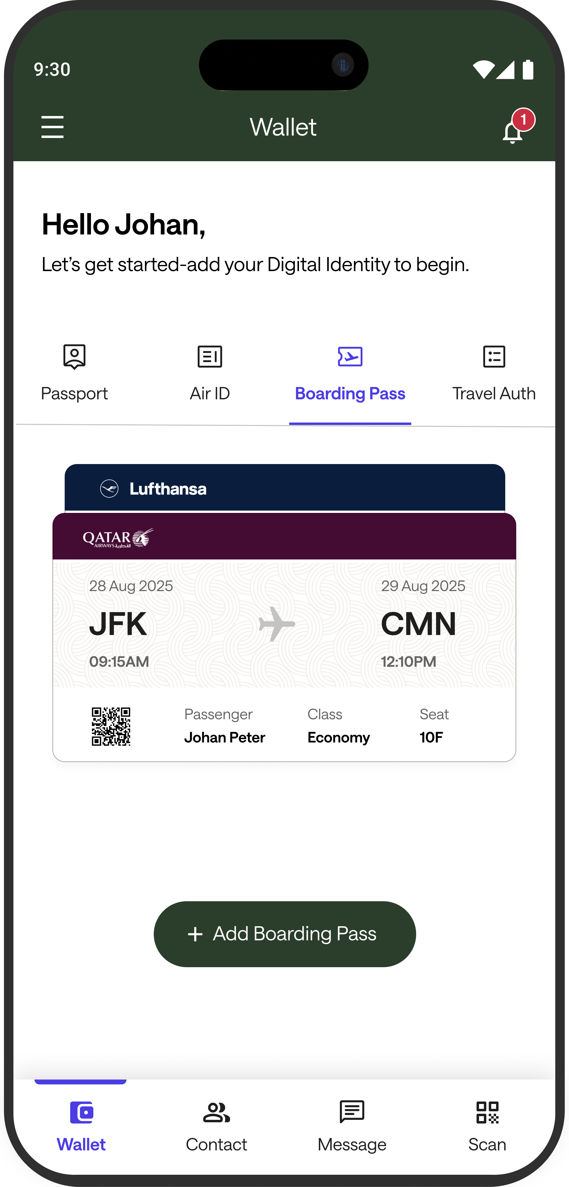
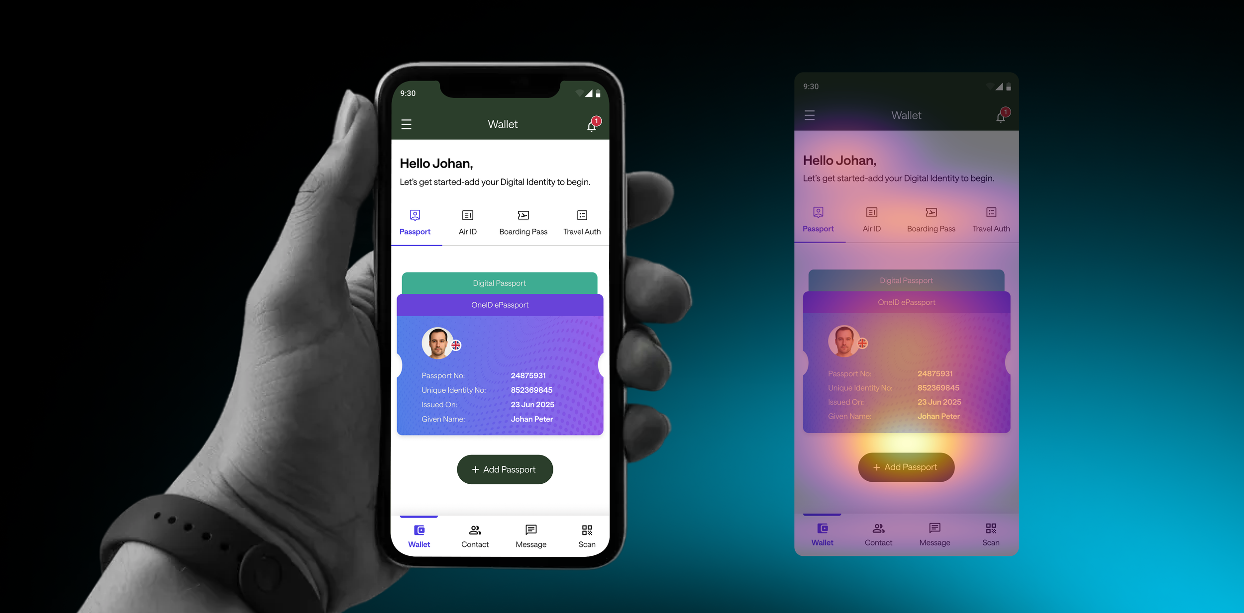
Add once. Access in one tap
I organized each credential (Passport, Air ID, Boarding Pass, Travel Auth) under Wallet tabs, so travelers can quickly check what’s stored without switching screens.
Design decisions → impact
Reduced retrieval time → predictable tabbed structure makes the next credential obvious.
Lower operational friction → clearer separation between credential types prevents “wrong doc” moments.
Improved throughput → designed for fast, repeat access in high pressure airport flows.
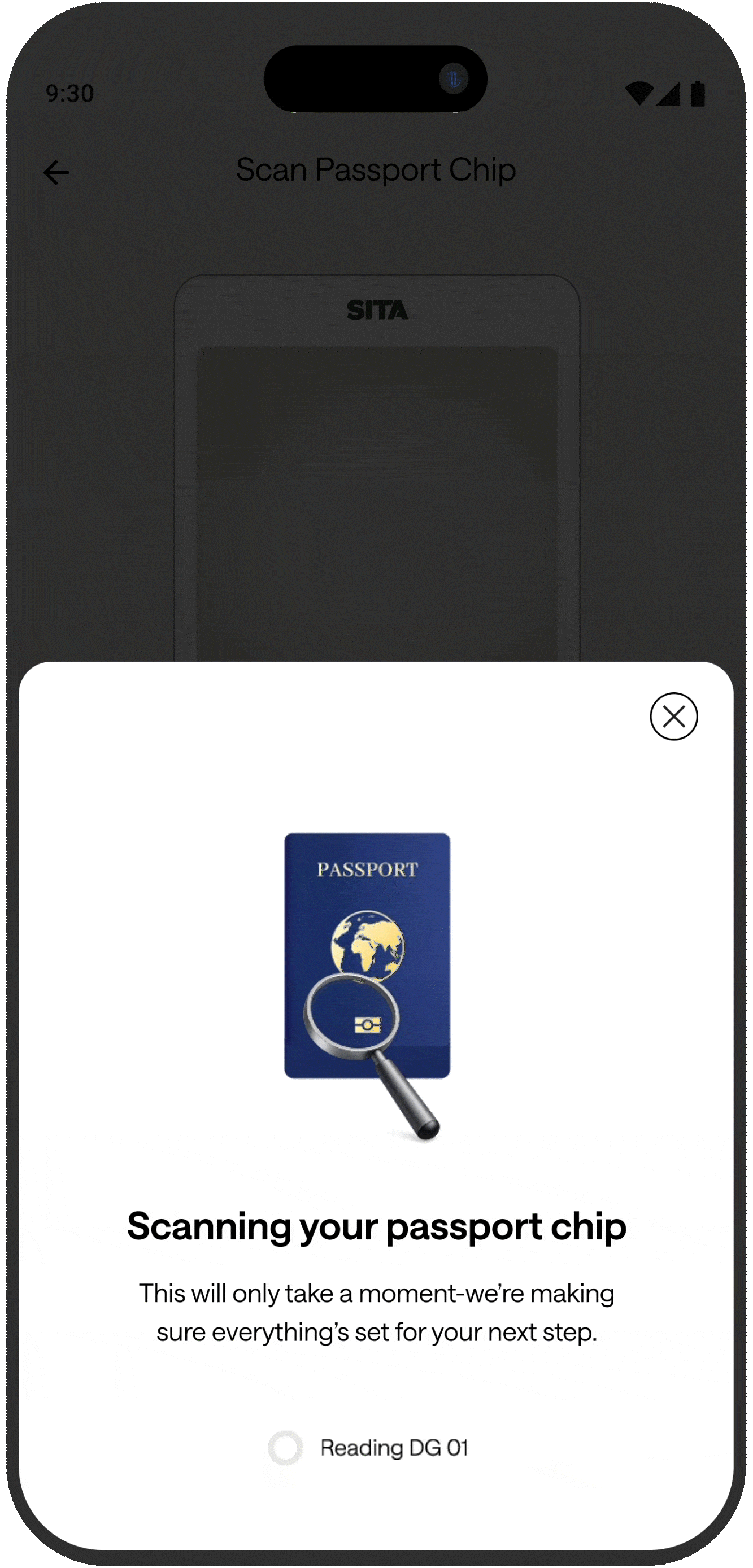
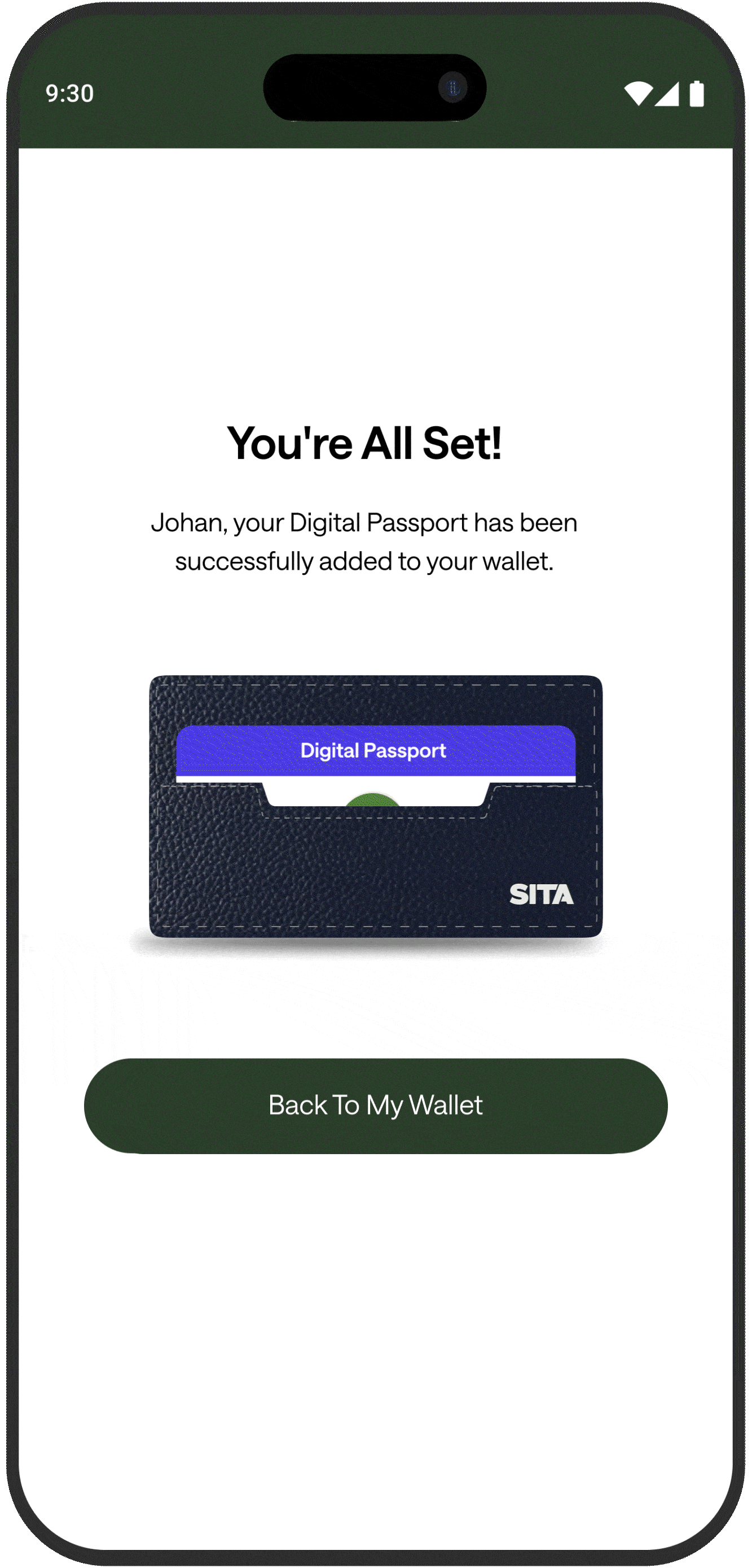
Motion that keeps travelers confident, step by step
I used motion to guide key moments in the journey - passport chip scanning and credential added - so travelers always understand what’s happening, what to do next, and when the passport is securely stored in Wallet.
Design decisions → impact
Structured progress during scanning → reduces uncertainty and prevents premature exits while verification runs.
Definitive success confirmation → eliminates “did it complete?” ambiguity and lowers repeat attempts.
Wallet-forward return path → keeps the journey consistent and accelerates re-access to the added credential.
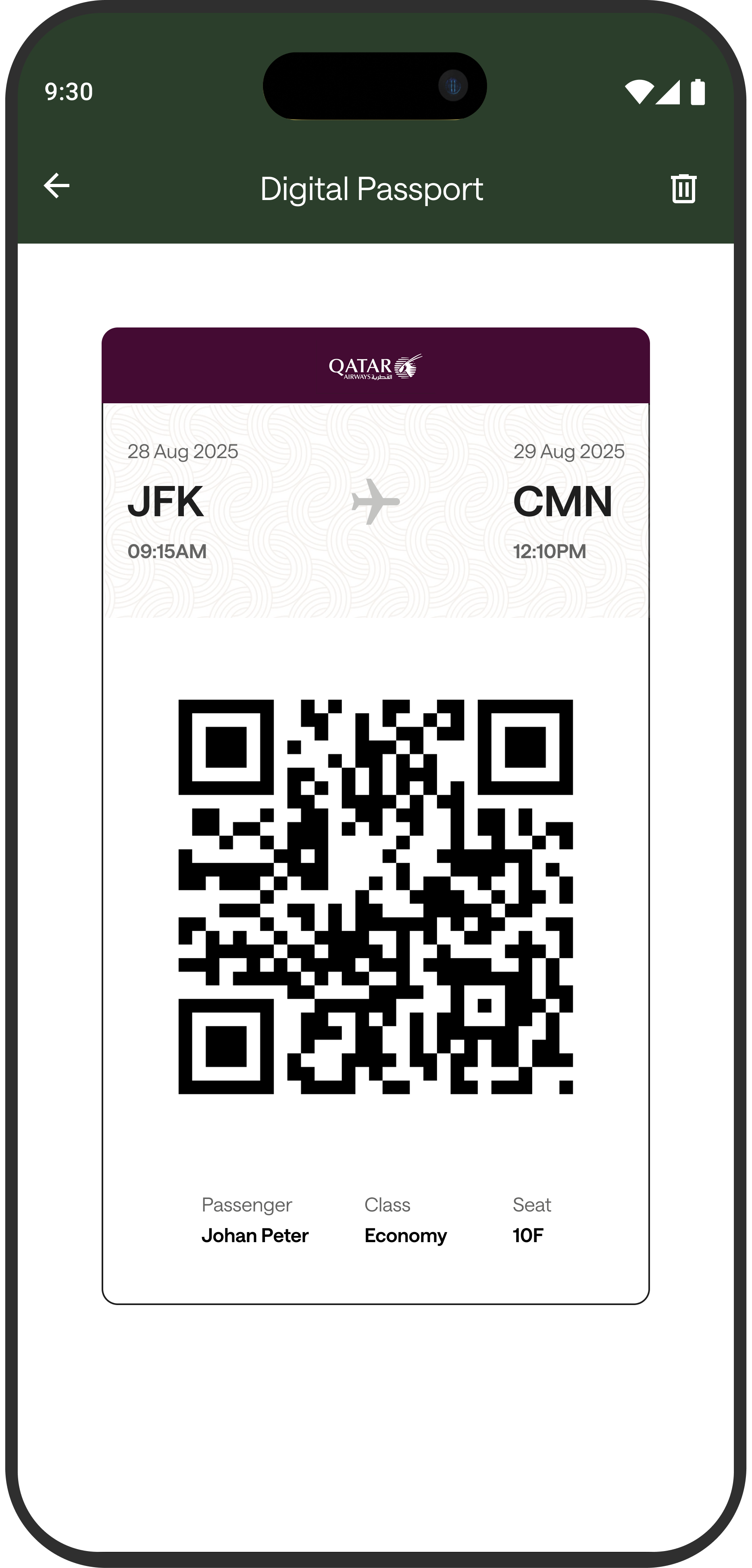


From Wallet to Gate without friction
I designed a QR-first Digital Passport view so travelers can present identity in seconds - without digging through screens or handing over a phone. The layout prioritizes scan success (large code, clear flight context) to keep queues moving and reduce errors at kiosks and checkpoints.
Design decisions → impact
Right credential, instantly → flight + passenger context stays visible above the QR, so travelers don’t second-guess what they’re presenting.
Faster scans, fewer retries → a large QR with clean whitespace improves scan success at kiosks and reduces re-scan moments.
Ready in one step → a single “present to scan” screen supports quick, repeat checks during check-in, security, and boarding.
Constraint
PHASE 01- No budget for usability testing in this phase
Approach
I used AI checks to catch hierarchy issues early and iterate with more confidence
Key takeaway
The screen supports a clear CTA → credential validation → navigation path. Keeping secondary elements visually quieter protects the first step and maintains setup momentum.
Heat level
🟡
🟠
Focus area
Primary Action — “+ Add Passport”
Credential Card — Passport
🟠
Document Tabs — Passport / Air ID / Boarding Pass / Travel Auth
🟣
Greeting + Instruction
🟣
Bottom Navigation
Why it matters
Confirms the first step is unmistakable → supports faster setup starts.
Builds confidence by showing “what’s stored” → reinforces control + trust after the CTA.
Useful choice point, but can steal focus from the primary action → keep secondary visually.
Sets context, but gets skimmed → rely on hierarchy, not text, to drive action.
For switching sections only → shouldn’t compete with the task on this screen.
How to read this heatmap
🟡 Hot (Yellow/White) → where users are most likely to act first
🟠 Warm (Orange/Red) → where users evaluate next
🟣 Cool (Purple/Dark) → elements users notice only if needed
Trade-offs & How I Reduced Risk
1) No user testing → used heuristics + walkthroughs + AI checks to reduce risk.
2) SDK ≤ 80MB → avoided heavy libraries and kept UI lightweight.
3) Security-first → designed patterns that don’t require external plugins.
Why this Wins
It solves a real operational problem, balances speed with trust, aligns with enterprise constraints, reduces delivery risk early, and supports both user experience and business outcomes—making it viable, scalable, and pitch-ready.