From Search to Shortlist 20% Faster
The updated dashboard reduced the time staffing partners spend finding suitable candidates by 20%, improving efficiency and accelerating hiring decisions.
My Roles & Responsibilities
Conducting User Testing, Creating User Persona, User Flow, Wireframe, Visual Design, Prototype
Team
Me + PM + Developer
Duration
70 Days
Tool
Figma, FigJam
About Staffing Partner?
A staffing partner dashboard/system is a tool or platform used to manage and organize data about employees who are currently on the bench (not assigned to specific projects).
This system helps staffing partners evaluate and identify candidates who meet the specific requirements of a client's project.
Understanding the System: How It Works

Step 1 - Recruiting Candidates
When the company is in the process of hiring candidates, the panel of interviewers creates an Excel spreadsheet (XLS) in which they provide scores and comments as per the skill set of candidates.
Step 2 - XLS syncs with staffing partner dashboard

After the panel submits the XLS, it is automatically synchronized with the staffing partner's dashboard, making it accessible to them.

Step 3 - Candidates on bench
Candidates are placed on the bench after finishing their projects.
The system used to work this way before
Step 4 - New project - clients requirements
The organization receives new project requirements for candidates requested by clients for their projects.
Step 5 - Staffing partner filters candidates based on requirements

The staffing partner accesses the dashboard with the goal of filtering candidates who are currently on the bench and possess skill sets that match the client's requirements for allocation to a project.
After understanding how the system works, I carefully plan testing sessions with a varied group of users, including both new and experienced dashboard users, to collect important insights and feedback.User Testing
Some scenario are:
🟢 This was my first step towards understanding the current system and user interaction, as well as how the system functions for users, the mental model of the user, and how users envision the system to be.

I noted in user testing: Users who worked more than 1 year on a system had fewer issues, while those with less than 6 to 7 months struggled more.User Journey
Outcomes of user testing
🟢 User journeys are a helpful way to communicate user testing results, to tell a story about how users interact with the product, and to assist team members in understanding users' experiences, problems, and opportunities for improvement.
I began analyzing the user journey to find improvement opportunities. After discussing with the Product Manager and Developers, I identified areas for improvement. Unfortunately, due to restrictions from senior authorities, I can't resolve the password and "Forgot Password" login issues at this time. We'll focus on other opportunities as a team.Opportunities found
Opportunities identified from the user journey
Password
Facing a problem of managing multiple passwords for different portals and services in PS.
Login
In the current system, a feature that seems to be lacking is the option for a "forgot password" functionality.
Dashboard
Users struggle to learn how to use a system because they assume how it works without clear instructions.
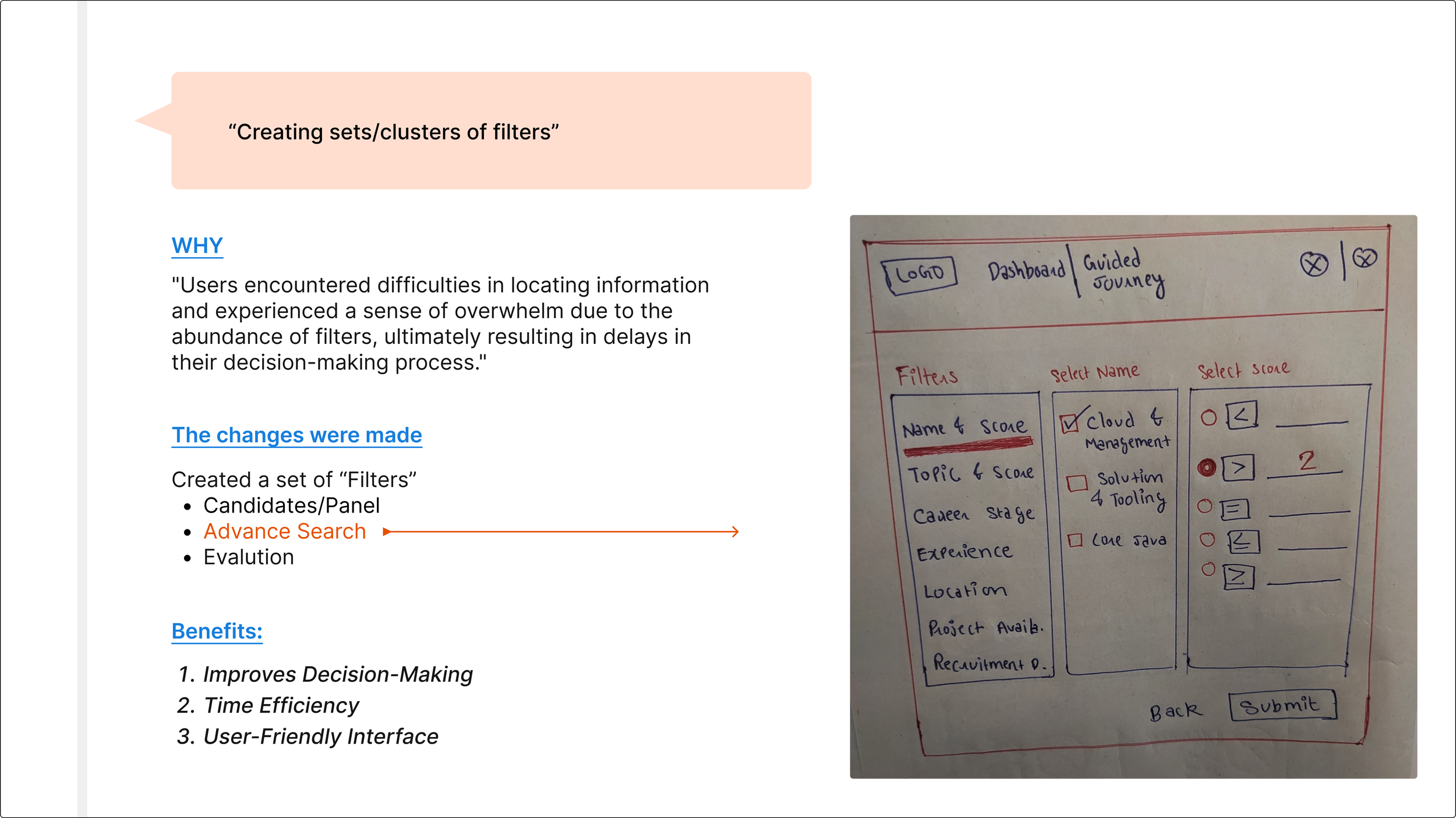
Filters
Filters needed-
filter by the total experience
filter by position
filter by project availabilityThere is a high level of findability in the filters.
They have difficulty understanding and using the filters that are available.
The absence of filter hierarchy at the forefront overwhelms users.
Lisiting
Unable to sort candidates based on scores.
Unable to view the filters used to fetch results for cross-verification of correct filtering.
Was puzzled about why the status "Rejected" appeared on the listing and how that will be helpful for them.
Detail Page
There's too much information.
Information is not in a logical way.
The page has excessive scrolling, making it difficult to read the important information.
I began by creating a "How Might We" (HMW) statement that everyone on the team agreed on, to help us solve problems and achieve success with our product.HMW facilitate user learning within the system by providing clearer instructions, reducing the reliance on assumptions, and enhancing the user experience?
HMW streamline the user experience in sorting candidates by scores, improving filter visibility and understanding, and enhancing the clarity of the "Rejected" status in candidate listings?
HMW streamline and optimize the detail page information to enhance user-friendliness and easy access while reducing the need for excessive scrolling?
HMW optimize filter functionality to enhance user experience, making it more efficient, user-friendly, intuitive, and organized hierarchically to minimize confusion and improve usability?
Ideation
Here are some of the ideas


User Flow
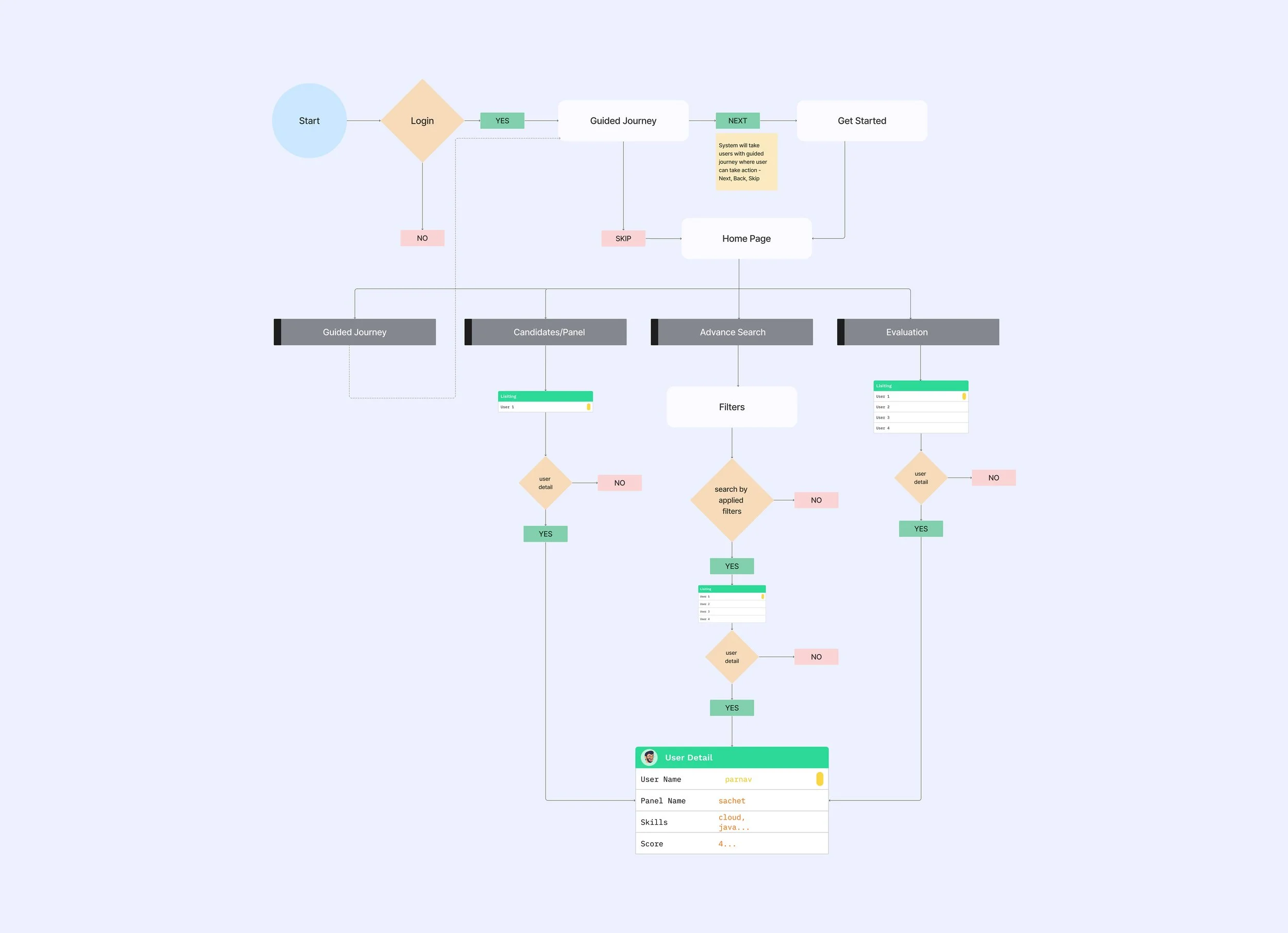
Initially, the project manager and team had a clear plan for the dashboard's design, but I thought there were better options for users. So, I had to come up with ideas to show them why these options would be better.PM and developers intend to design this
-
Their familiarity with and regular interaction with this type of dashboard in their daily lives influenced their decision.
-
Their perspective was that many dashboards shared a similar design approach, leading them to conclude that integrating this design into our system would provide a superior user experience.
My Proposal
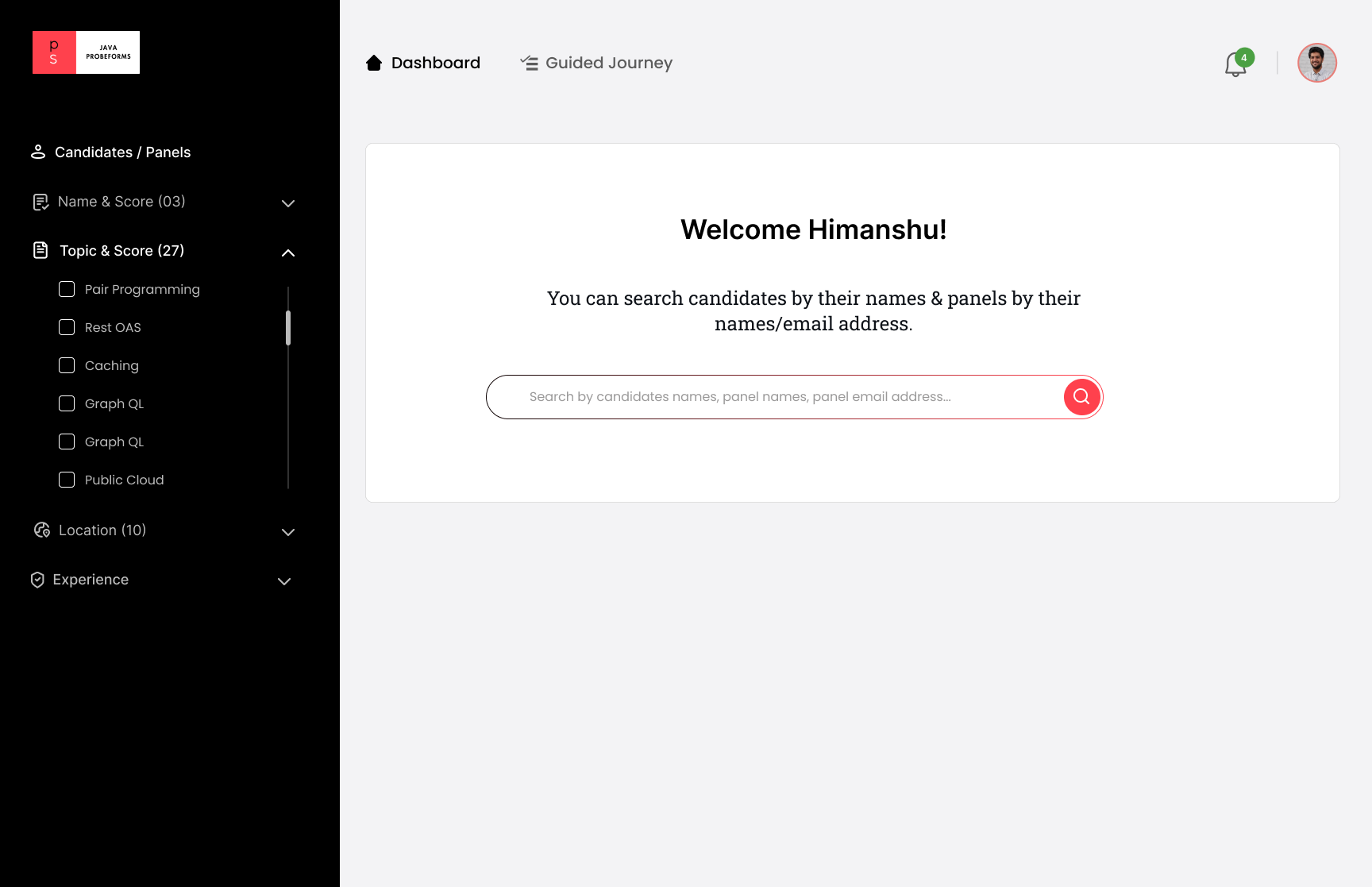
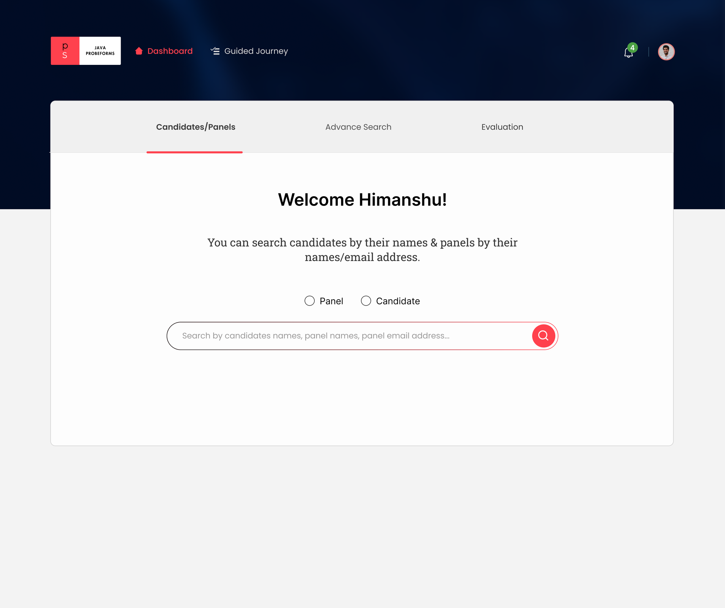
-
I propose simplifying the user experience by presenting them with three tabs to select their intended action. Subsequently, we will display relevant filters based on their choice, preventing information overload and enhancing the user experience.
-
This can offer several benefits to our users:
Faster Task Completion
Personalization
Error Reduction
Enhanced Decision Support
Iteration

Insight from user testing
-
While testing, we discovered that staffing partners require somethig to identify candidates who are not fully engaged in projects and can be reassigned to other projects for half occupancy.
-
A 30% allocation from the client is required. Staffing partner use filter by "Project Availability" and choose 30% occupancy. The system then recommends candidates with 30% available occupancy for the project.
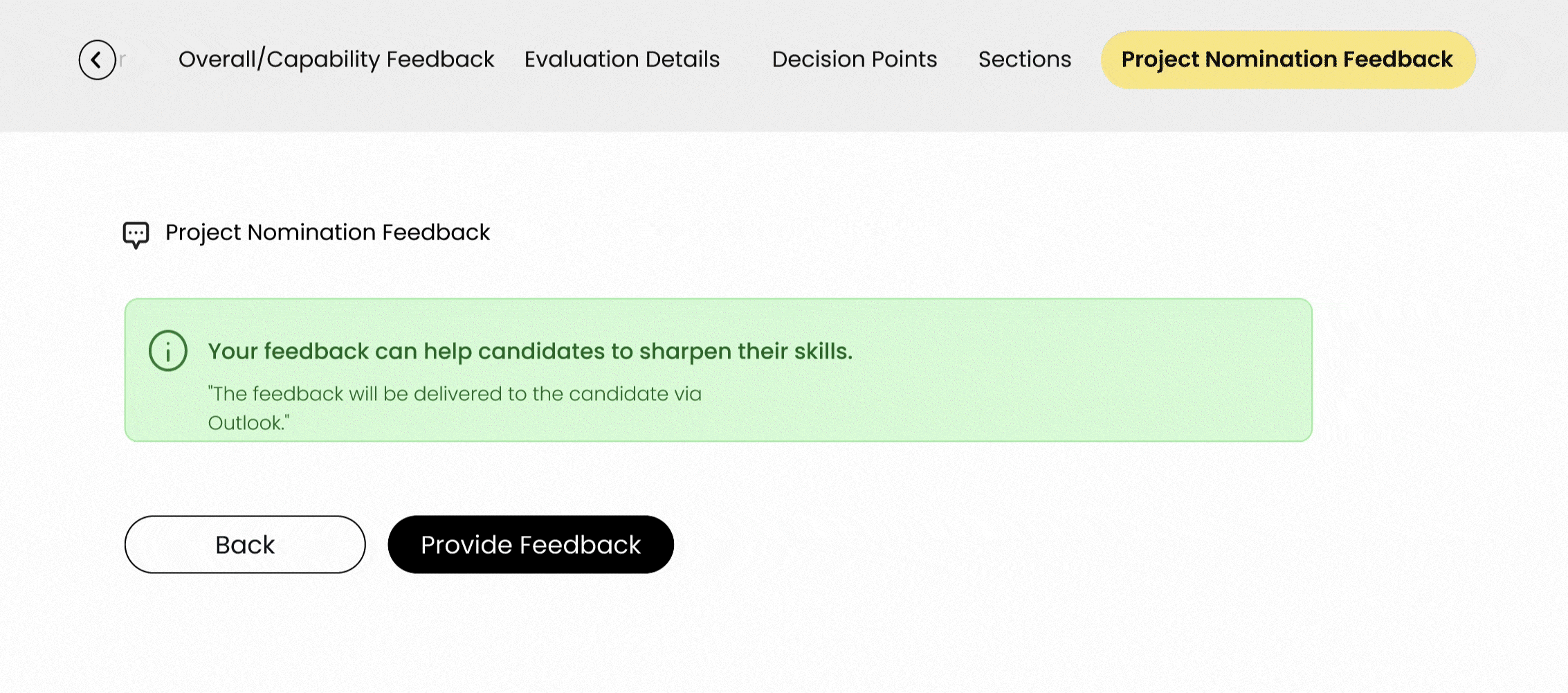
Insight from user testing
-
During testing, we discovered that the staffing partner has tackled concerns regarding the process when a candidate faces rejection in a client interview. The focus now is on how other staffing partners can receive information to ensure they can review feedback before nominating the candidate to another client.
-
Candidate "Krishna" was rejected in the client interview. Staffing partners can document feedback in the "Project Nomination Feedback" tab for others to review. This helps identify candidate weaknesses and suitability for client needs.
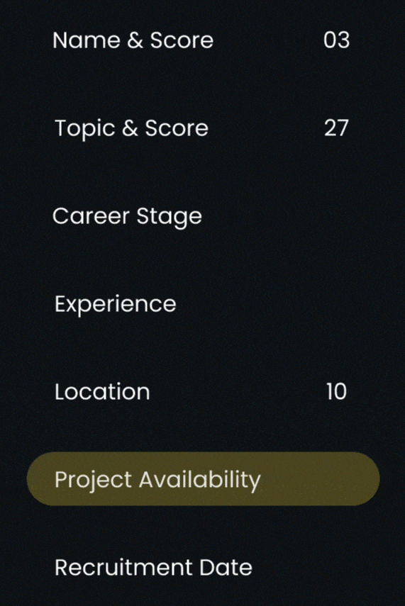
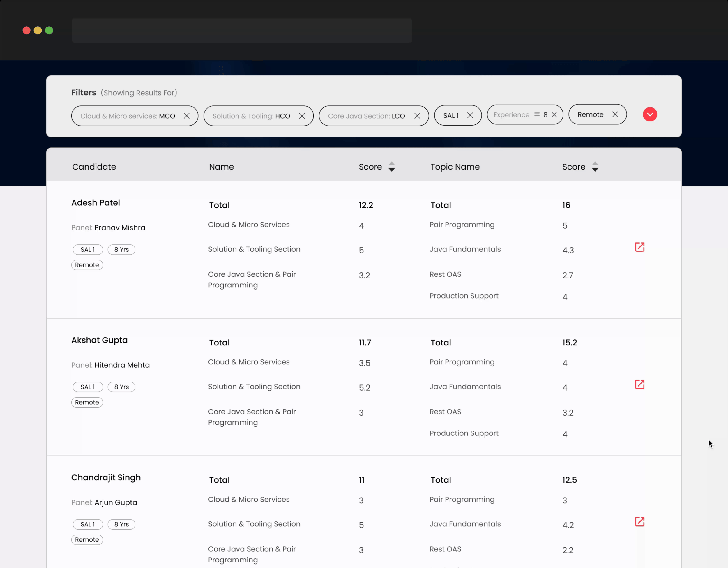
Here are the primary UX enhancements that led to a 17-20% reduction in candidate search duration.“HMW optimize filter functionality to enhance user experience, making it more efficient, user-friendly, intuitive, and organized hierarchically to minimize confusion and improve usability?“
Optimized filter functionality
During our research, we found that users had trouble finding and using filters. They also had difficulty understanding the filters because of confusing names, which made it harder to learn.
I have organized filters into three sections with clear headings that describe what users can find within each section.
To make it easier for users to understand and navigate, filters are grouped in a way that aligns with their mental model.
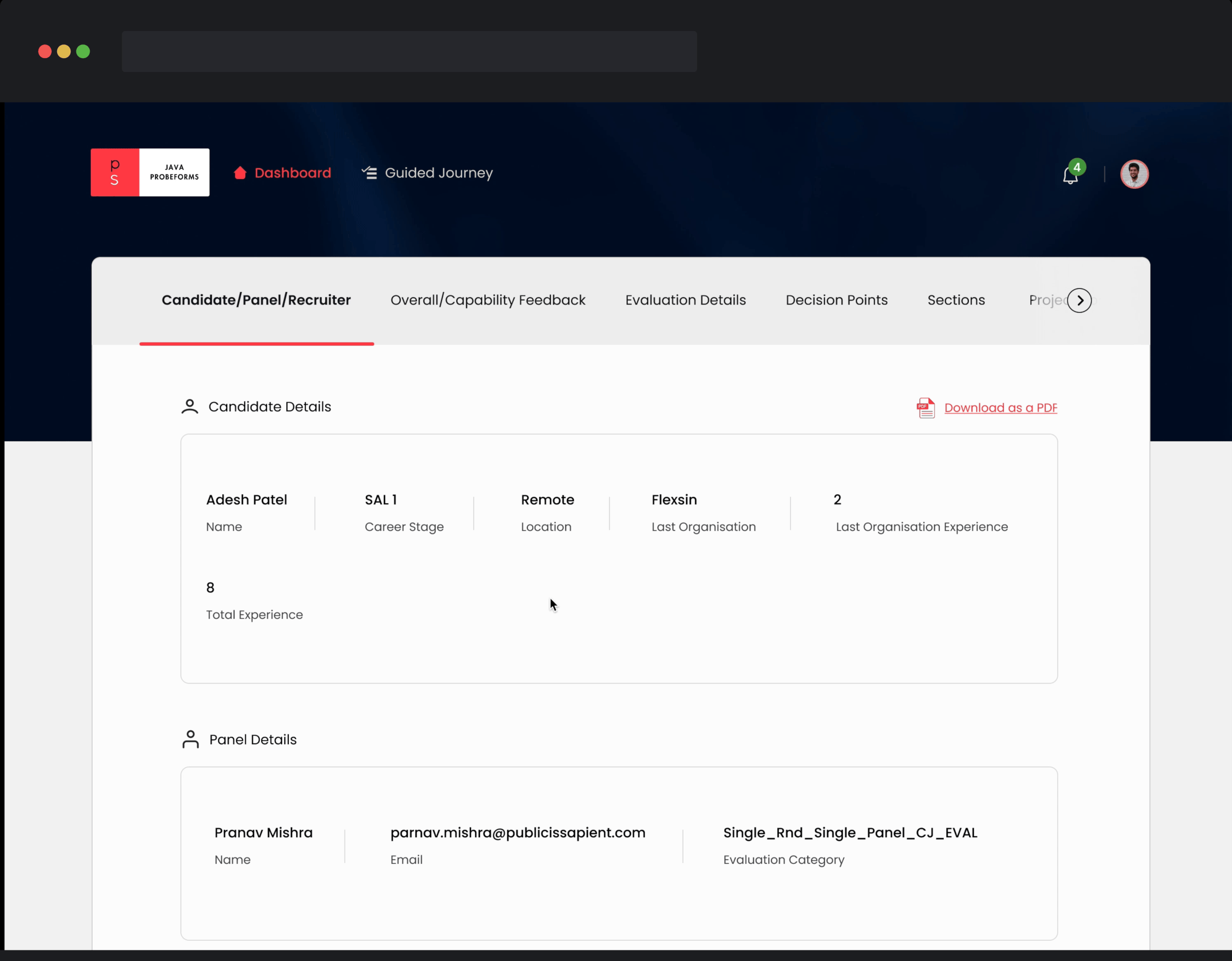
“HMW streamline and optimize the detail page information to enhance user-friendliness and easy access while reducing the need for excessive scrolling?“
Enhancing page clarity
In our research, we found that users were facing issues, particularly excessive scrolling to locate vital information, which negatively impacted their decision-making due to reduced findability on the page.
I organized the page's information into logical groups for easier understanding by staffing partners. Each group is then placed in a tab based on its hierarchy.
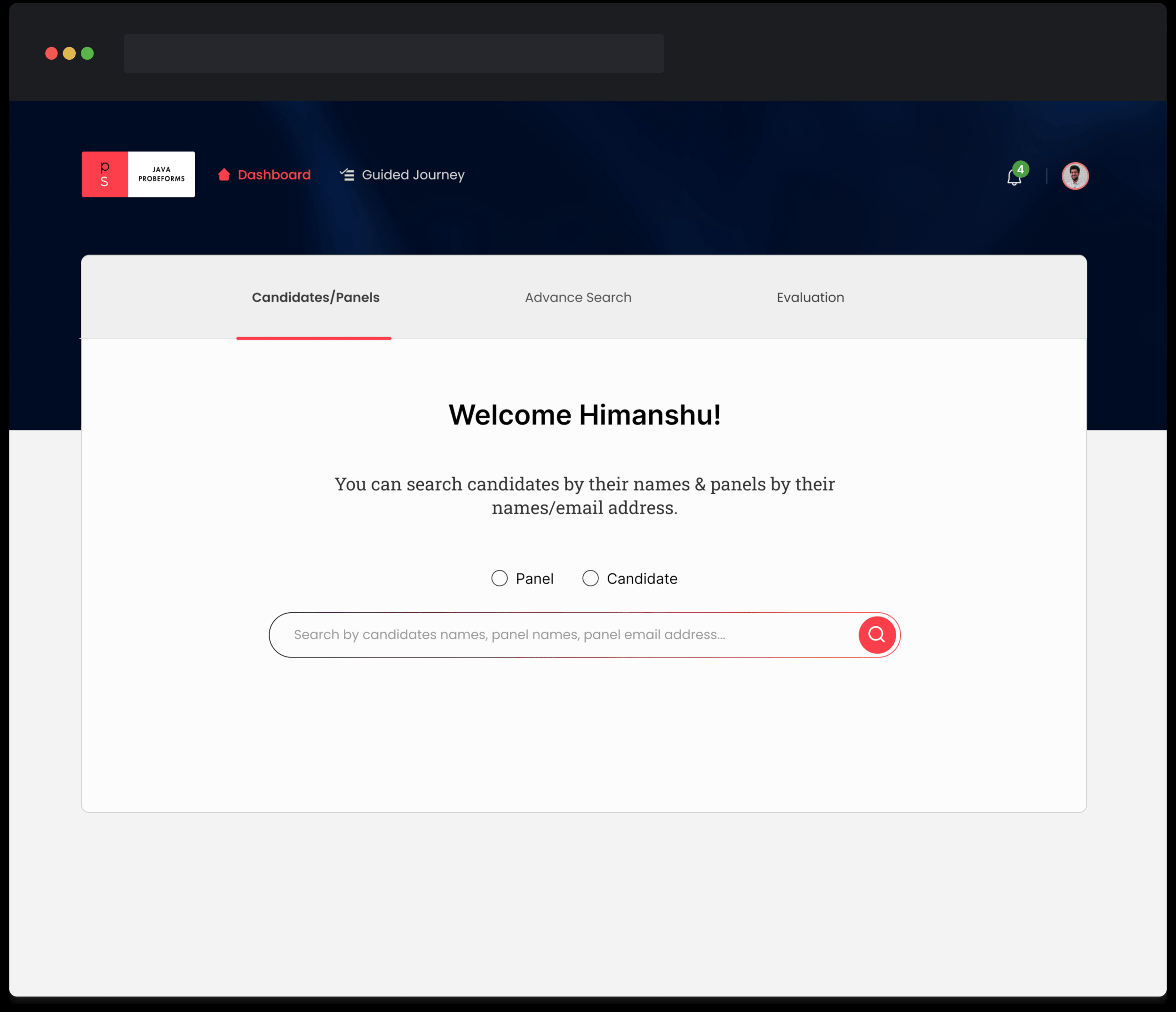
“HMW facilitates user learning within the system by providing clearer instructions, reducing the reliance on assumptions, and enhancing the user experience?”
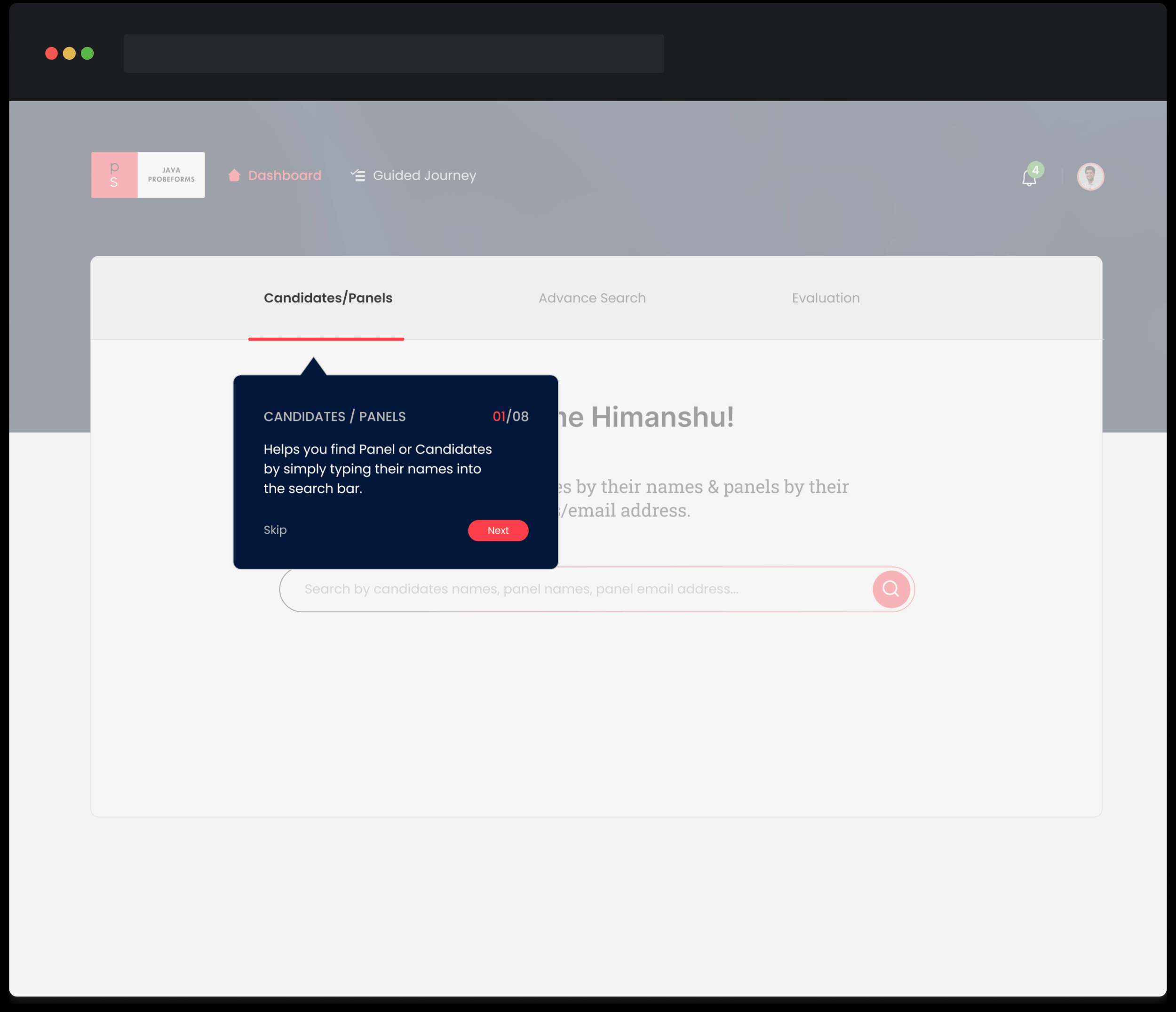
Guided path for a staffing partner
When users log in for the first time, the system will guide them through a journey to help them learn about filters and other useful features.
Users have the option to skip the journey or easily access the guided journey with just one click from the home page.
During our research, we found that users struggled to understand the system and ended up wasting time due to making assumptions.
“HMW streamline the user experience in sorting candidates by scores, improving filter visibility and understanding, and enhancing the clarity of the "Rejected" status in candidate listings?“
Simplifying the listing page
In our research, we found that users had difficulty using the listing page, which made it take longer for them to choose a candidate.
In order to facilitate faster decision-making, I've improved the presentation of listing information and hierarchy, providing users with a quick and informative overview.
A successful revamp
Users can quickly and effortlessly find the features and information they need without any confusion.
The updated dashboard now reduces the time required to find suitable candidates for clients by 20%.
Takeways
Mapping out a huge system looking at pain points across the breadth of the system, and then prioritizing these opportunities and pain points to arrive at a problem space.
There is no set way to approach a problem. It is important to take steps according to what makes sense at the moment, and it might take going back and forth multiple times in order to figure out how to proceed.
Figuring out the use cases plays a huge part before jumping into the design, ensuring that we don't miss any cases while designing.